My role
👩💻
Designing a collaborative photo-sharing platform from 0 to launch — across mobile, web, and growth.
Playlog is your all-in-one solution for capturing, sharing, and reliving life's most memorable moments with friends and family. As the lead product designer, I shaped the product from zero to launch, owning the full UX/UI design across mobile and web.
Over the course of four years, I collaborated closely with the CEO, product manager, engineers, and marketers to define the MVP, launch the product, and redesign the marketing website. My work spanned user flows, wireframes, high-fidelity designs, prototypes, and a scalable design system.
I also partnered with growth teams to translate user feedback into iterative improvements — optimizing both experience and conversion. This case study showcases my ability to lead end-to-end design and deliver user-first solutions in a fast-moving startup.
🔎
Focus
End-end product designer
iOS design
Web design
🛠️
Tools
Figma
Slack
Jira
⏰ Time
⏰
Ongoing
(2021 – present)
👥
Client
Playlog Group Inc.
Overview
How can we remove every barrier between capturing a memory and sharing it with the people who matter most?
That was the question at the heart of Playlog.
When we looked at existing photo-sharing platforms, we saw a gap: while users could store thousands of photos, the experience of creating albums, sharing memories, and inviting others often felt heavy, complicated, and transactional. Playlog set out to change that — to create a seamless, high-quality, and privacy-first platform that made collaboration as easy and joyful as the moments themselves.
The Problem
Most photo-sharing platforms are built for storage — not storytelling or connection.
Users are overwhelmed by cluttered interfaces, lost in endless folders, and frustrated by poor-quality uploads. Organizing content becomes a burden, especially when albums stack up without intuitive categorization.
Worse still, privacy controls are inconsistent or hard to find leaving users unsure of who's seeing what. For moments that matter most like weddings, birthdays, or family milestones this lack of clarity, control, and quality erodes trust in the experience.
The Solution
I helped redesign the Playlog experience with one clear goal: make sharing memories feel as effortless as capturing them.
To do that, I focused on simplifying every part of the user journey. Creating an album now takes just a few guided steps, with event-based categories, built-in privacy settings, and optional prompts to encourage meaningful contributions from guests.
Every interaction was designed to feel intuitive, from inviting others to managing privacy. The result is a clean, fast, and joyful platform — one that's built not just for storage, but for real connection.
Solution snapshot
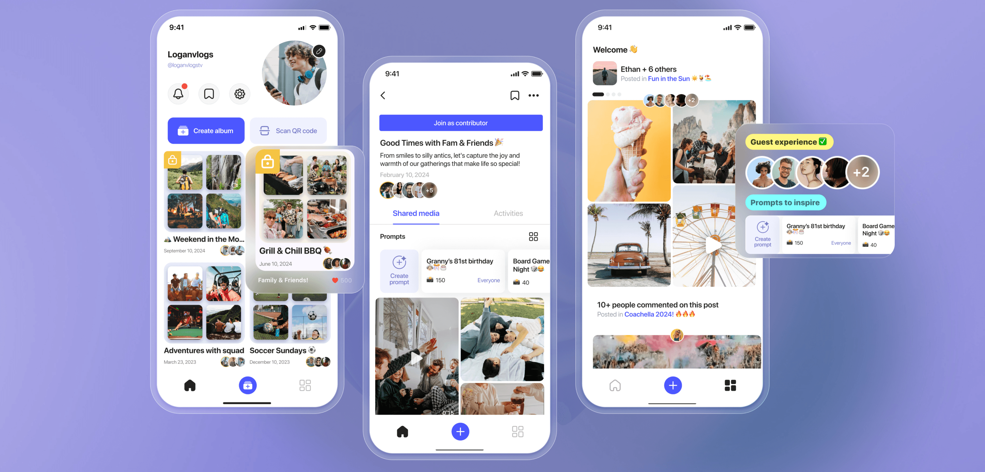
Key screens that bring Playlog to life
Dive into Playlog’s core flows → from the very first welcome screen through to live event creation and see how every tap is optimized to get users sharing memories faster. In under a minute, hosts can name their event, lock down privacy settings, add fun prompts, and generate a shareable link or QR code. With clear visual cues and one-screen setup, Playlog removes friction so users spend less time configuring and more time connecting.
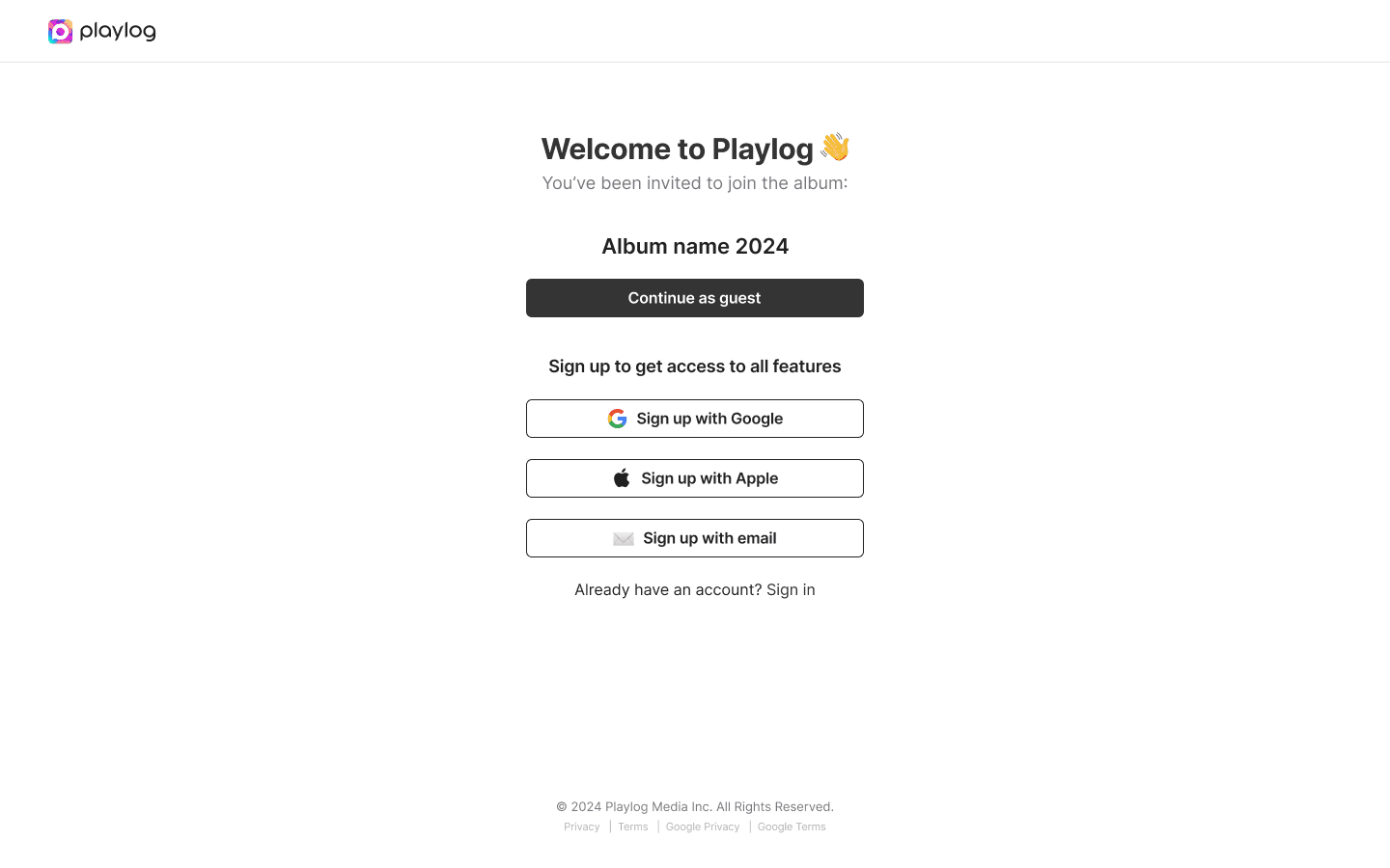
ONBOARDING
Why we redesigned onboarding
In our initial rounds of testing, 40 % of new users dropped off before creating their first event. They didn’t know what Playlog was for—or why they should spend time setting anything up. We needed an experience that:
Communicates the core promise instantly. (“Capture + share in under 3 taps.”)
Reduces cognitive load. One screen, one clear CTA.
Builds trust up front. Emphasize “no account needed” and “private by design”
What we learned: by surfacing the app’s value in the very first frame, and keeping the sign in elements (passwords, username, displayname, birthday) as minimal as possible, we cut onboarding drop-off by 25 % and boosted first-time event creation by 30%.
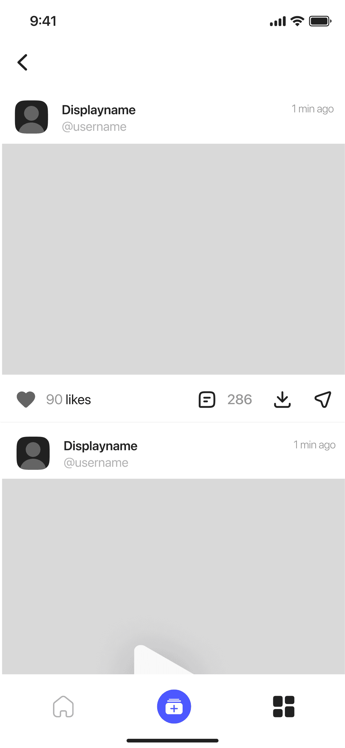
GUEST EXPERIENCE
Magic in Collaboration — no logins, no friction
Once a host creates an event, sharing it should feel as easy as handing someone a photo. To make that happen, we designed a completely no-login flow:
Designing guest access to feel effortless
Instant links & QR codes
Guests scan or tap a single link—no app install, no account creation.
One-tap contributions
View or upload photos and videos with a single button press.
Barrier-free participation
Whether it’s a wedding toast or a conference demo, anyone can join in seconds.
CREATING AN ALBUM
Create albums in under 30 seconds
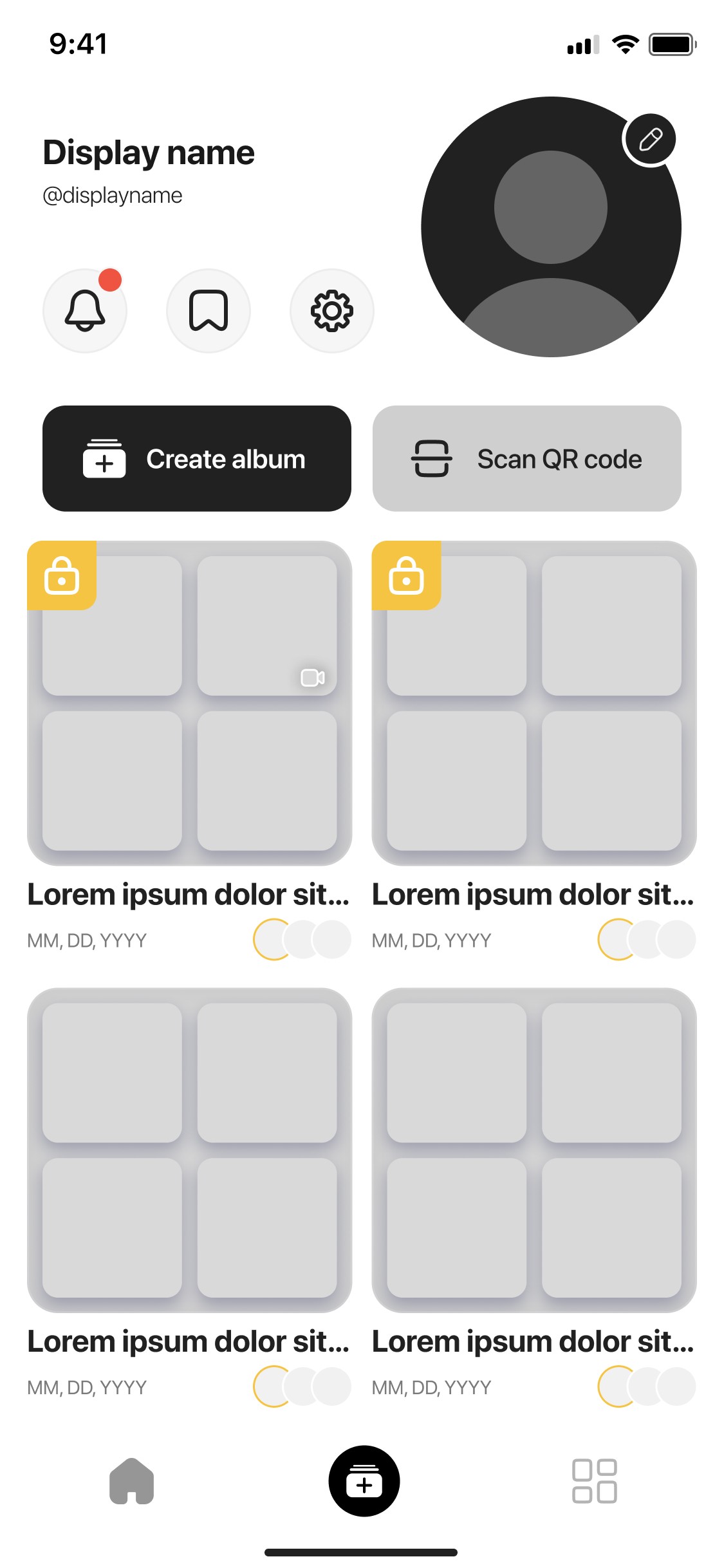
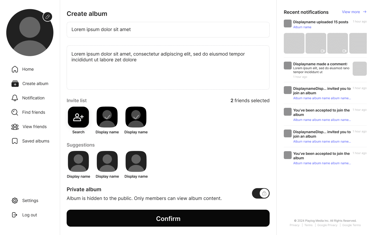
Starting a shared album shouldn’t feel like a chore. In our early user tests, hosts dropped off when forced through multi-step forms and hidden privacy settings. I collapsed naming, inviting, and access controls into a single, scannable screen—so you can get from zero to “go live” without hesitation.
Single-screen setup: Enter an album name, invite friends, and tweak privacy all in one place.
Instant sharing: Invite contributors right when creating an album
Inline privacy controls: Toggle to keep the album private or public are right next to the relevant fields, no buried toggles.
Momentum first design: With one clear “Create” button, hosts complete setup in three taps or less, cutting abandon-rate by 25%.
Reducing friction in album creation
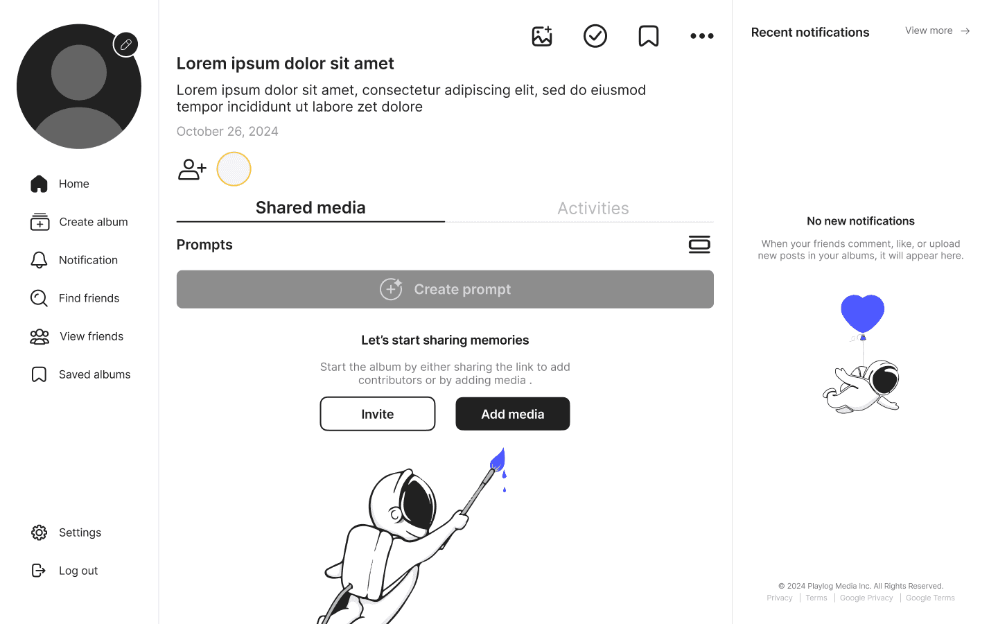
ADDING PROMPT
Adding context to memories, one prompt at a time
Through interviews, users often felt aimless about what to share. To guide contributions, we built an optional “Prompt” field directly into the album setup screen:
It turns uploading into storytelling, which helped drive engagement across event types.
Host-defined prompts for narrative context
Editable at any time, before or after sharing
3× increase in engagement & richer contributions
Encouraging meaningful contributions

Product Backgound
Let’s dive deeper...
We wanted to understand the emotional context around photo sharing today.
Despite having access to countless apps and cloud tools, people still struggle to actually share their memories in a way that feels easy, private, and meaningful.
The deeper I looked, the more it became clear: most tools are optimized for storage, not connection.
🗂️
Fragmented Repositories
“I never know where to look for everyone’s photos.”
Photos live in group chats, social feeds, cloud drives, and buried camera-roll albums forcing users to hunt through multiple apps just to see a friend’s snapshots. True memory-sharing needs a single, unified place that’s as simple as opening the app.
🔒
Account Friction & Privacy Overhead
“I don’t want to create a password just to view Anna’s wedding pics.”
Every new platform adds sign-ups, permissions, and confusing privacy toggles. That friction turns sharing into a chore and drives drop-off before the first photo is ever uploaded.
💬
Shallow Engagement
“I’m not sure what to post, so I just skip it.”
Without context or guidance, guests share random snaps or nothing at all. Memories become bland streams of images instead of stories. A few well-placed prompts can transform a photo dump into a narrative that keeps everyone involved.
Research & competitive analysis
Benchmarking existing photo-sharing tools
Once we’d nailed down Playlog’s core gaps fragmented storage, signup friction, and lack of engagement, we turned to the market. We reviewed App Store feedback and did heuristic audits on the biggest players to see where they excel and where they let users down.
I wanted to understand: Where are users already sharing memories and why isn't it working for events?

📱 Major Storage Apps
(Google Photos, Dropbox, iCloud)
💬 Messaging App
(WhatsApp, Messenger, Signal)
📱 Social Media
(e.g. Instagram, TikTok, BeReal)
👨👩👧 Similar Photo Apps
(FamilAlbum, Tinybeans)
✔️ Strengths: Trusted for backup and archiving
❌ Weaknesses: Not built for sharing socially, often gated by storage paywalls
💡Insight: Reliable for storing, but not for interacting or storytelling
✔️ Strengths: Already established peer groups, easy access
❌ Weaknesses: Media quality is compressed, poor long-term organization
💡Insight: These tools are free and familiar, but not designed for preserving memories.
✔️ Strengths: High engagement, free, and built-in user behaviour
❌ Weaknesses: Not intended for large batch uploads, memories are ephemeral and scattered
💡Insight: Great for moments, but not for memory keeping or group curation.
✔️ Strengths: Focused, privacy-centric experiences
❌ Weaknesses: Overloaded interfaces, low trust, and often require convincing others to join
💡Insight: Too niche or clunky to gain wide adoption quickly
User Interviews
To uncover what really matters to users when sharing memories, we conducted 1:1 interviews with a diverse group of 15+ people aged 16–60.
We spoke with university students, parents, travellers, creators, and everyday smartphone photographers.
What I learned wasn't just about usability. It was emotional. People want to be generous with their memories but only when it feels easy, safe, and meaningful.
Across all ages and use cases, one theme kept coming up:
The best photo sharing doesn't feel like "sharing" at all—it just flows.
User personas
Leveraging the insights we uncovered in interviews and app reviews, we crafted a set of Playlog user personas that span our full spectrum of hosts and contributors from event creation, seamless contribution, and multi-generational archivists. These personas were instrumental in surfacing the subtle differences in how each group approaches event setup, privacy preferences, and engagement drivers, ensuring our design meets their unique needs.

Findings & Analysis
Emerging patterns across user behaviours
After distilling interviews, usability tests, and feedback loops, four core themes consistently surfaced regardless of age, event type, or technical comfort level. These insights became the North Star for every design decision that followed.
📷
Not just storage it's memory making
Users want albums that feel like moments, not folders. They're curating emotional experiences, not just saving images.
🙋
The "champion" is tired
The person organizing and nudging others feels burnt out. Users want tools that encourage participation, not pressure.
🔗
Sharing breaks when it feels like work
Steps like downloads or logins kill momentum. QR codes and shareable links are must-haves for flow.

🔐
Quality and privacy are expected
People assume high-res uploads and clear visibility settings. If it's confusing or hidden, trust erodes quickly.
Without categorization or context, albums feel messy. Event tags and prompts help users build purposeful collections.
What we learned
After digging into user feedback and usability testing, four clear insights emerged that shaped our design priorities. These core lessons guided every decision from zero-friction sharing to contextual prompts ensuring each feature directly addresses real pain points.
Too many uploads ≠ meaningful memories
📸
"When everyone dumps all their photos, I don't know what to look at.”
Mass uploads overwhelmed users. Many expressed the need for photo prompts or filters to help surface meaningful contributions.
Albums need personality, not just storage
🗂
“All the photos are there... but it doesn't feel like an event."
Users wanted albums to feel intentional. Event tagging, themed prompts, and album types helped make each memory feel curated.
If it takes explaining, it's already too hard.
✋
"I don't want to explain how to use an app just to get photos from people."
Users didn't want to guide guests through a new platform. QR codes and instant links (no account needed) became a must-have solution.
Privacy is assumed, but not always clear
🔒
“I shared an album and didn't even know if it was private or not.”
Users were confused by privacy settings in other apps. They wanted a visual cue (like a lock icon) and one-tap control over visibility.
User Flow
Guiding every tap for clarity, collaboration,
and control
To visualize how every tap and swipe fits into the bigger picture, I distilled our research and requirements into three core user journeys: album creation, guest collaboration, and privacy management. By charting each step from entry to completion, I spotlighted opportunities to streamline key interactions, eliminate dead ends, and ensure consistency across screens. This holistic view let us verify that every screen transition feels intuitive, guests know exactly where to go next, and privacy controls are never more than a tap away—setting the stage for the detailed flow diagrams below.

Each step was intentionally laid out to:
Minimize friction: Collapse multi-step forms into single-screen actions
Boost participation: Surface upload and contribution prompts at the right moment
Reinforce trust: Keep privacy toggles visible and contextual
These flows ensure that hosts can launch an event in seconds, guests can join and share without barriers, and everyone feels confident their memories stay secure all driving long-term engagement.
How I solved Product Challenges
Turning core product hurdles into streamlined, user-centric solutions
Drawing on user research and quantitative data, I tackled four critical hurdles that held Playlog back. By streamlining album setup, clarifying uploads, enabling zero-login group sharing, and baking in subtle engagement nudges, each solution was crafted to eliminate frustration and keep users coming back. Below are the core challenges and the high-impact fixes I delivered.
💡 Solution
🔥 Challenge #1
User Drop-Off in Album Setup


Through testing, I found users abandoned album creation due to too many steps. I simplified it into a one-step flow with auto-generated prompts to guide them. This reduced friction and boosted completion rates.
Before
After
Uploading Photos Was Too Confusing
Users struggled with finding where to upload images.
I introduced a middle-tab quick upload button that surfaced the action instantly, leading to a more intuitive experience.
🔥 Challenge #2
💡 Solution

🔥 Challenge #3
Users Wanted a Seamless Way to Collect Photos from Large Events
(i.g weddings)
Created the ‘Guest Experience’ feature, allowing users to contribute photos via a simple magic link—no need to create an account, reducing friction in group sharing.
💡 Solution


🔥 Challenge #4
Ensuring Engagement &
Repeat Usage
Implemented subtle engagement nudges like prompts and notifications for album activity to encourage ongoing use beyond a single event.
💡 Solution


🧠 Challenge
✅ Solution
Team members often have varying opinions on design direction or priorities, leading to disagreements and delays in decision-making.
I used my visual communication skills to bridge the gap between different perspectives.
Prototyping early allowed team members to see concepts in action, which made it easier to align on the final direction.
When there were differing opinions, I would create flow charts / low-fidelity wireframes to bring clarity, allowing everyone to visualize potential solutions and understand trade-offs. This made discussions more objective, helping us focus on the user impact rather than abstract ideas.
03
⚡ Challenge
✅ Solution
Working in a fast-paced startup meant there were constant pivots, tight deadlines, and evolving priorities.
I adopted a flexible, agile workflow to stay efficient and responsive.
Worked in sprints with clear, quick feedback loops to ensure the team could iterate rapidly while keeping the focus on the most critical features.
I prioritized tasks and collaborated closely with the product and development teams to ensure that designs could be implemented within the given timeframes, adapting quickly to shifting requirements.
02
⚖️ Challenge
✅ Solution
With limited resources, team members often had competing priorities or features to focus on.
I facilitated discussions to identify the most urgent user needs and aligned the team around business goals.
Used user stories and data-backed insights to drive decisions and ensure that the most impactful features were given priority, avoiding the trap of working on features that weren’t adding enough value.
03
How I Solved Team Challenges
Enabling alignment, agility, and focus in a
fast-moving startup
In a lean, high-velocity environment, design direction often risked getting sidelined by shifting priorities, resource constraints, and healthy but time consuming debates. To keep momentum without sacrificing quality, I established clear decision frameworks, lightweight alignment rituals, and transparent prioritization practices. These mechanisms ensured we could rapidly converge on design choices, pivot gracefully when roadmaps changed, and concentrate our limited bandwidth on the highest-impact features.
Design System & Style Guide
Foundations for a consistent, on-brand Playlog experience
In the following section, you’ll find a detailed breakdown of each visual building block that drives Playlog’s look and feel. I’ve organized this guide into four key lists: Typography, Iconography, Colours, and low-fidelity screens.
Blue
Hex code:
#4C57FF
↗
MAIN ACTION COLOUR
Hex code:
#FFFFFF
White
↗
BACKGROUND
COLOUR
Hex code:
#6F75CA
Purple
↗
SUB-ACTION /
BUTTON COLOUR
Hex code:
#F0F1FF
Light purple
↗
SUB-ACTION /
BUTTON COLOUR
Hex code:
#212121
Grey
↗
BODY TEXT
Yellow
Hex code:
#F5C443
↗
SUB-ACTION /
BUTTON COLOUR
#FFC17C
#11C8DE
#62E1A4
#F47E80
#7ECFF4
#80D8C8
#CECECE
Errors
#FBE4E4
#CB2020
Warning
#FFF6DF
#7D6831
Success
#EAFEF7
#7DD5B4
Accent colour
Typography
SF PRO Display
For Playlog’s mobile app, I chose SF Pro Display as the primary typeface to ensure a clean, accessible, and modern experience across all devices. Designed by Apple specifically for digital interfaces, SF Pro offers exceptional readability, consistent rhythm, and visual balance — especially on smaller screens.
ABCDEFGHIJKLMNOPQRSTUVWXYZ
ABCDEFGHIJKLMNOPQRSTUVWXYZ
1234567890
Icons
For Playlog, I implemented a curated set of system-based icons to maintain clarity, consistency, and scalability across the mobile and web experience.


Low-fidelity screens


Website low
fidelity screens
UI kit component
Playlog’s atomic building blocks for a unified interface
Below is a catalog of every reusable UI element from primary CTAs to status toggles organized into clear categories. Each component includes its visual style, interaction states, and spacing guidelines so that designers and engineers can build new screens quickly while maintaining Playlog’s signature look and feel.
A Few Components


Test highlights
Validating our solutions
We ran moderated usability sessions spanning ages 18–50 to benchmark our redesigned flows. Across three core tasks onboarding, photo uploads, and contributions our changes consistently outperformed the legacy experience.
Frictionless entry drives conversion
Onboarding & SSO Integration
To further streamline first-time use, we added Single Sign-On (SSO) options Google and Apple directly on the welcome screen. Instead of creating a new username and password, users could now tap one button and be instantly authenticated.
In our pilot roll-out:
SSO Uptake: Over 70 % of new users chose Google or Apple SSO on day one.
Signup Spike: Overall account creations jumped 40 % in the first two weeks post-launch.
Drop-off Reduction: The percentage of users abandoning at the “Create Account” step fell from 18 % to just 4 %.
By coupling our single-screen onboarding flow with one-tap SSO, we transformed sign-up from a multi-field form into a near invisible step unlocking faster user acquisition and letting more people dive right into capturing and sharing memories.


Select first, assign later
Streamlined Photo Upload
To eliminate the pain of hunting for the upload button and buried album lists, we introduced a central “Quick Upload” tab that reverses the traditional flow.
Now, users:
Tap once on the prominent middle-upload button to open the system photo picker.
Select all the images they want to share—no album context needed.
Choose an album from a clean, scrollable list view that’s presented after selection.
This decoupled approach delivers:
Instant discovery: 95 % of participants spotted and used the upload tab on sight.
Reduced context-switching: Users stay focused on picking photos, then on organization, never both at once.
Faster completion: Time to upload dropped by 30 % in our usability tests.
Scalable clarity: As users create more albums, the list view remains easy to scan and navigate.
High-Fidelity Screens
Foundations for a consistent, on-brand Playlog experience
These polished designs translate our style guide and user flows into a living prototype. Built in Figma, each screen reflects the full visual language and intuitive layouts while demonstrating critical touch points.
Quick visual breakdown

Onboarding & SSO Integration
Create Album
Home & Album Overview
Other mobile screens
Web screens
Reflection
What we learned
We are continuing to grow and the wins we saw so far confirm that clear, user-centric flows drive real product growth. We’ll harness these learnings to explore other ways like deeper personalization, richer analytics, and more to continue to refine Playlog into the ultimate memory sharing platform.
🚀
Increased user onboarding completion by 25%
After redesigning the onboarding flow with 3-tap sign-up and SSO (Google/Apple), users completed account creation faster and with less friction.
🎯
80%
increased engagement
By streamlining album creation into just a few guided steps (event type → title → privacy → prompts), users were able to set up albums faster, reducing the drop-off rates.
🔗
Boosted Guest Participation with Seamless Sharing
QR code invitations & instant links allowed guests to upload media without needing an account, leading to a higher volume of shared memories per event.

Check it out for yourself.

Get the Playlog App
Scan the QR code to download the iOS app directly from the App Store.

Find us on web 👉 www.playlog.com
OR