Check it out for yourself.

Get the Playlog App
Scan the QR code to download the iOS app directly from the App Store.

Find us on web 👉 www.playlog.com
OR


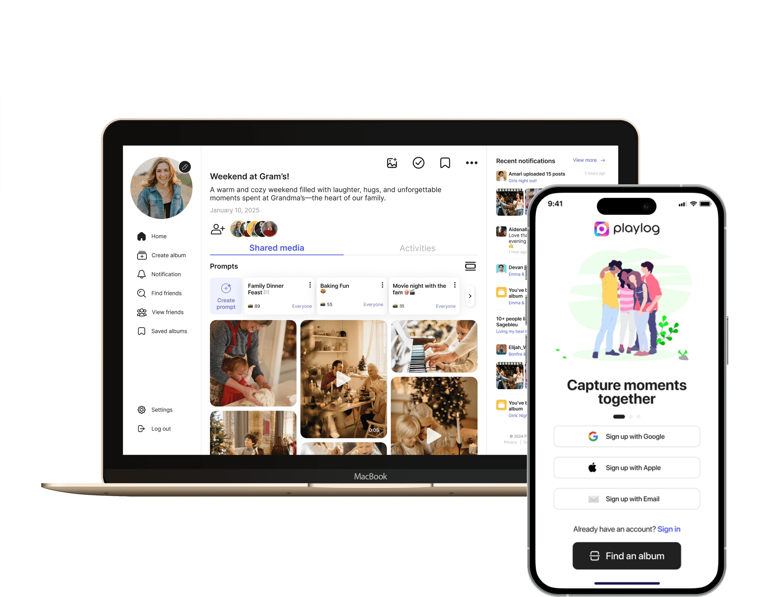
High-fidelity web screens


📈 Achieved
RESULTS
🚀 Increased user onboarding completion by 25%
After redesigning the onboarding flow with
3-tap sign-up and SSO (Google/Apple), users completed account creation faster and with less friction.
80%
🎯 Increased engagement
By streamlining album creation into just a few guided steps (event type → title → privacy → prompts), users were able to set up albums faster, reducing the drop-off rates.
🔗 Boosted Guest Participation with Seamless Sharing
QR code invitations & instant links allowed guests to upload media without needing an account, leading to a higher volume of shared memories per event.

High-fidelity screens
High-fidelity screens
Onboarding

Onboarding

Finding friends
Creating prompt
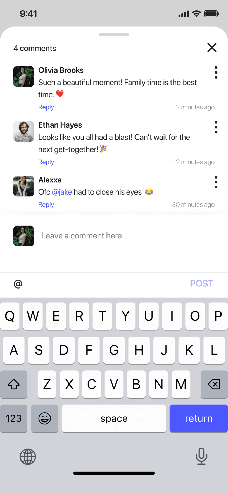
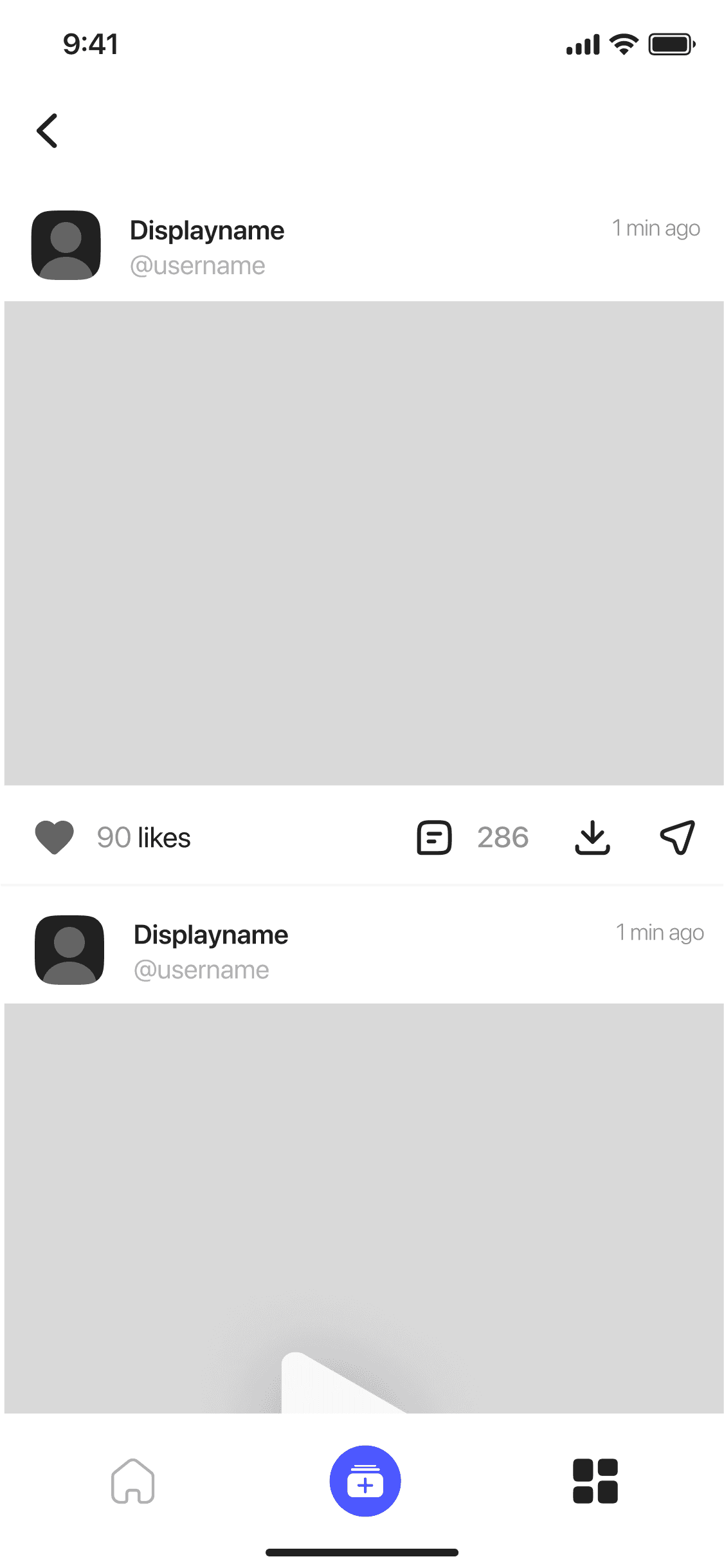
Comments
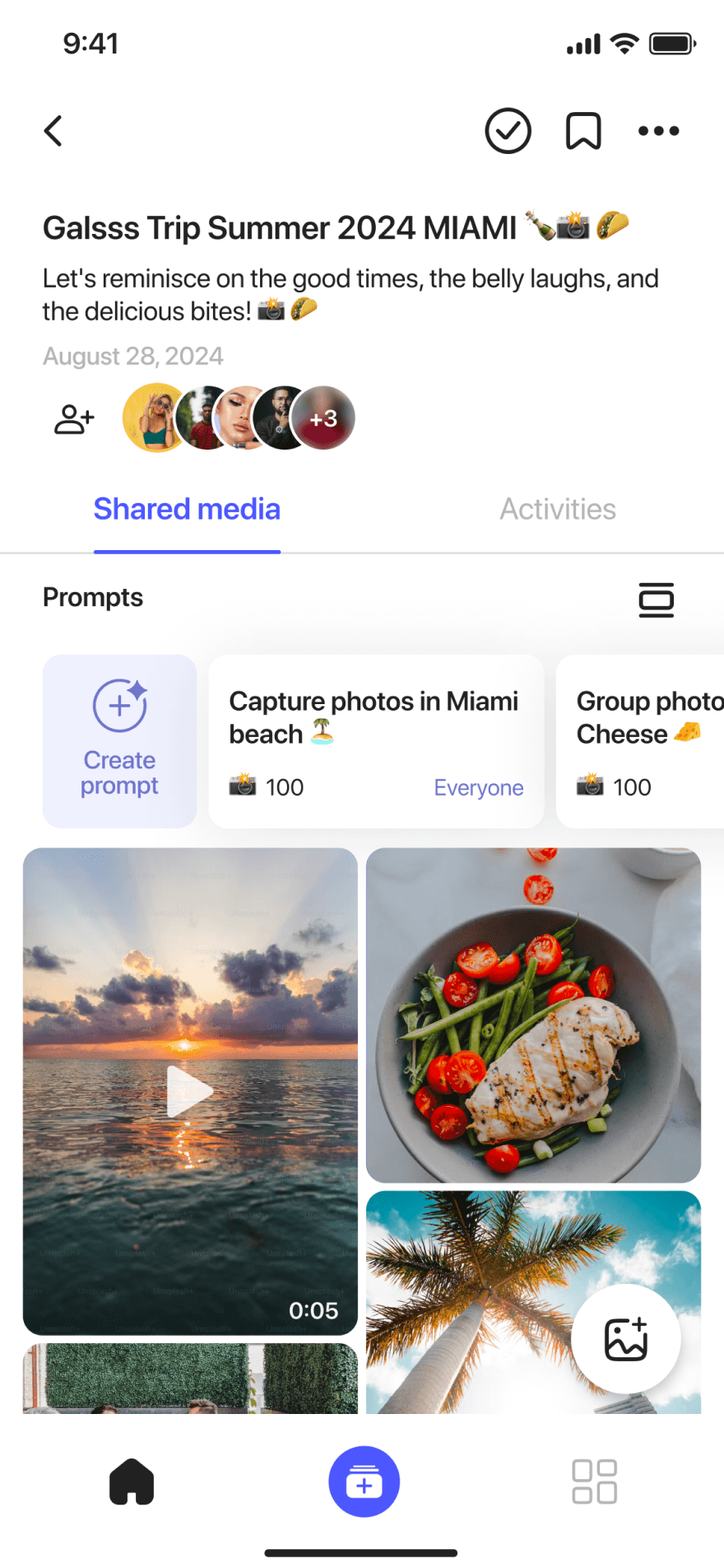
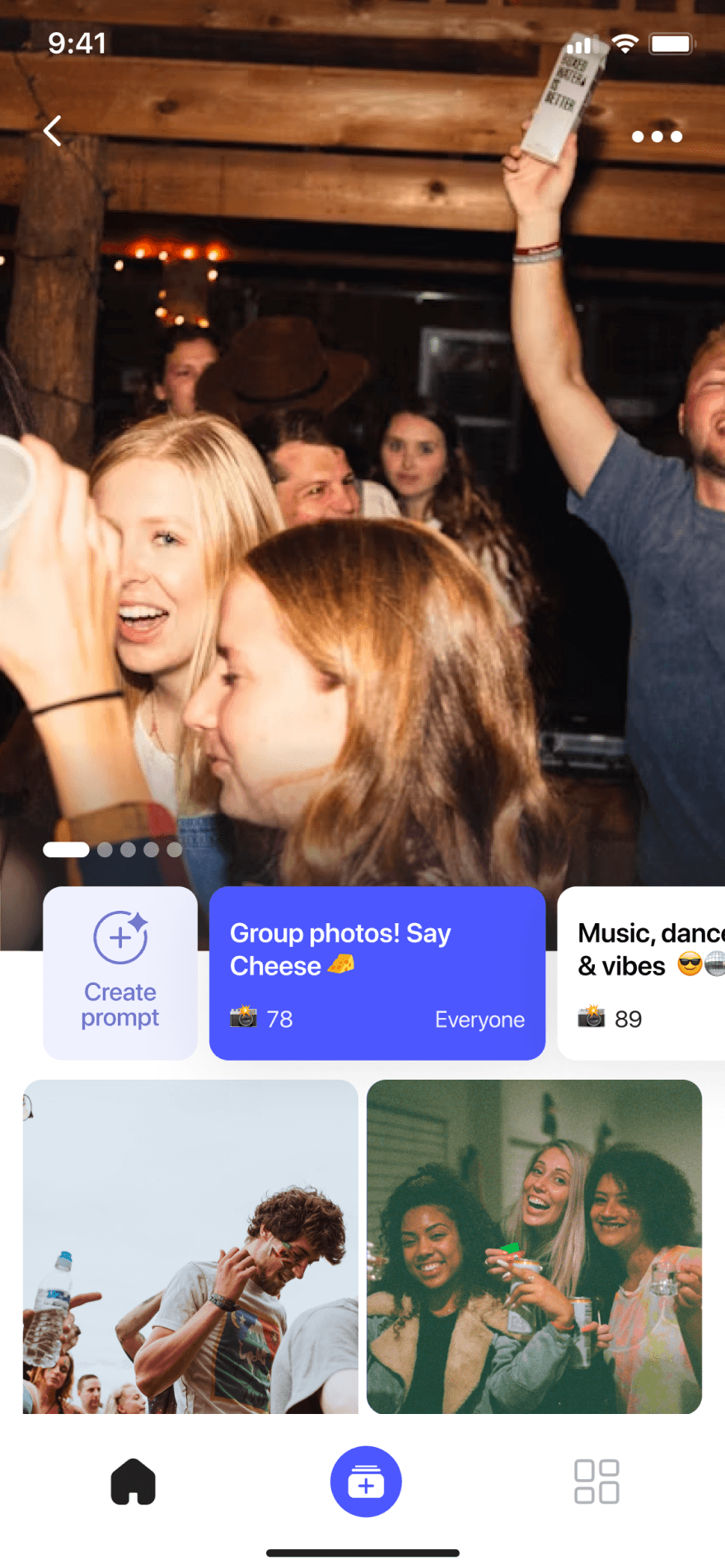
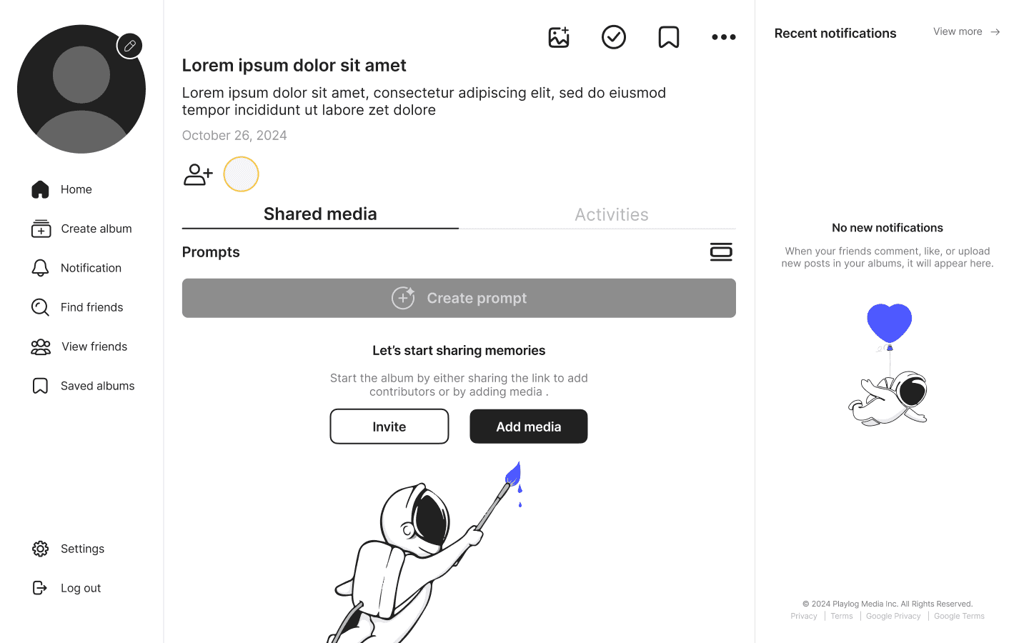
Album overview

Uploading media
Prompt page
Share QR code
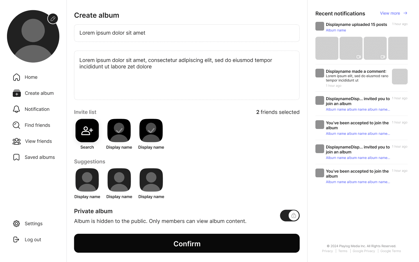
Creating album

Members in album
Uploading in prompt

Feed page

Few Components
Display name options
UI KIT
SF PRO Display
Icons
Style guide
For Playlog’s mobile app, I chose SF Pro Display as the primary typeface to ensure a clean, accessible, and modern experience across all devices. Designed by Apple specifically for digital interfaces, SF Pro offers exceptional readability, consistent rhythm, and visual balance — especially on smaller screens.
ABCDEFGHIJKLMNOPQRSTUVWXYZ
ABCDEFGHIJKLMNOPQRSTUVWXYZ
1234567890
Blue
Hex code:
#4C57FF
↗
MAIN COLOUR
Hex code:
#FFFFFF
White
↗
BACKGROUND
COLOUR
Hex code:
#6F75CA
Purple
↗
SUB-ACTION / BUTTON COLOUR
Hex code:
#F0F1FF
Light purple
↗
SUB-ACTION / BUTTON COLOUR
Hex code:
#212121
Grey
↗
TEXT / SUB SECTION
Yellow
Hex code:
#F5C443
↗
SUB-ACTION / BUTTON COLOUR
Accent colour
#FFC17C
#11C8DE
#62E1A4
#F47E80
#7ECFF4
#80D8C8
#CECECE
Errors
#FBE4E4
#CB2020
Warning
#FFF6DF
#7D6831
Success
#EAFEF7
#7DD5B4
For Playlog, I implemented a curated set of system-based icons to maintain clarity, consistency, and scalability across the mobile and web experience.


Web low
fidelity screens
Low-fidelity screens
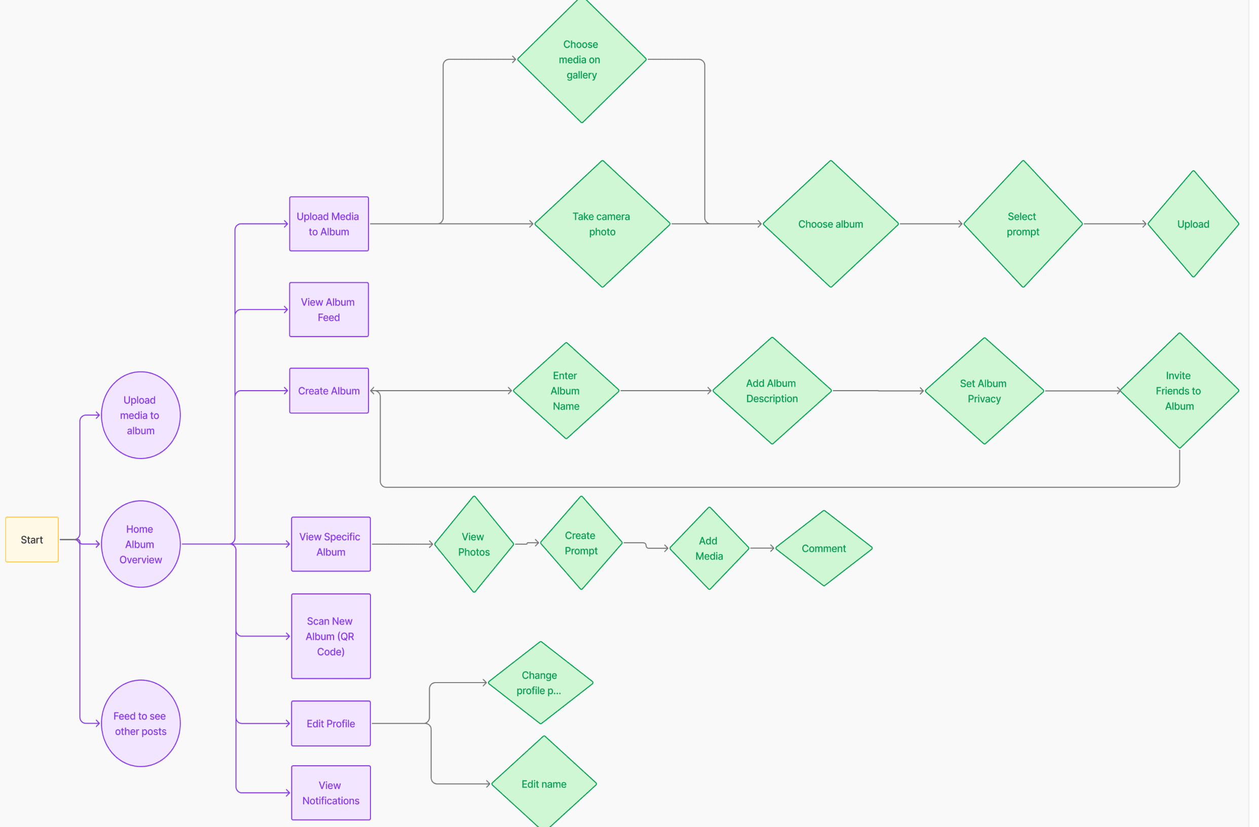
User Flow
To ensure a seamless and scalable user experience, I mapped out clear user flows focused on three key objectives: simplifying album creation, enhancing collaboration, and reinforcing privacy controls. Each interaction was intentionally designed to minimize friction, increase guest participation, and drive long-term product engagement.
How I Solved Team Challenges
How I Solved Prouct Challenges
🔥 Challenge #1:
🔥 Challenge #2:
🔥 Challenge #3:
🔥 Challenge #4:
User Drop-Off in Album Setup
“Uploading Photos Was Too Confusing”
Users Wanted a Seamless Way to Collect Photos from Large Events (i.g weddings)
Ensuring Engagement & Repeat Usage


💡Solution
Through testing, I found users abandoned album creation due to too many steps. I simplified it into a one-step flow with auto-generated prompts to guide them. This reduced friction and boosted completion rates.
💡Solution
Users struggled with finding where to upload images. I introduced a middle-tab quick upload button that surfaced the action instantly, leading to a more intuitive experience.
💡Solution
Created the ‘Guest Experience’ feature, allowing users to contribute photos via a simple magic link—no need to create an account, reducing friction in group sharing.
💡Solution
Implemented subtle engagement nudges like prompts and notifications for album activity to encourage ongoing use beyond a single event.
After
Before

📷
Not just storage it's memory making
Users want albums that feel like moments, not folders. They're curating emotional experiences, not just saving images.
🙋
The "champion" is tired
The person organizing and nudging others feels burnt out. Users want tools that encourage participation, not pressure.
🔗
Sharing breaks when it feels like work
Steps like downloads or logins kill momentum. QR codes and shareable links are must-haves for flow.
🔐
Quality and privacy are expected
People assume high-res uploads and clear visibility settings. If it's confusing or hidden, trust erodes quickly.
Without categorization or context, albums feel messy. Event tags and prompts help users build purposeful collections.
Overall after synthesizing all our interviews, testing notes, and usability insights, a few patterns stood out across demographics and sharing behaviours:
Findings & Analysis
What We Learned
If it takes explaining, it's already too hard.
"I don't want to explain how to use an app just to get photos from people."
Users didn't want to guide guests through a new platform. QR codes and instant links (no account needed) became a must-have solution.
✋
Too many uploads ≠ meaningful memories
"When everyone dumps all their photos, I don't know what to look at.”
Mass uploads overwhelmed users. Many expressed the need for photo prompts or filters to help surface meaningful contributions.
📸
Privacy is assumed, but not always clear
“I shared an album and didn't even know if it was private or not.”
Users were confused by privacy settings in other apps. They wanted a visual cue (like a lock icon) and one-tap control over visibility.
🔒
Albums need personality, not just storage
“All the photos are there... but it doesn't feel like an event."
Users wanted albums to feel intentional. Event tagging, themed prompts, and album types helped make each memory feel curated.
🗂
To uncover what really matters to users when sharing memories, we conducted 1:1 interviews with a diverse group of 15+ people aged 16–60.
User Interviews
We spoke with university students, parents, travellers, creators, and everyday smartphone photographers.
Before diving into features or wireframes, I wanted to get close to the moments that matter.
What I learned wasn't just about usability. It was emotional. People want to be generous with their memories—but only when it feels easy, safe, and meaningful.
Objectives for the interviews:
Understand how users currently organize and share their photos
Identify pain points in group sharing and album creation
Learn what motivates (or stops) users from contributing photos
Discover emotional triggers around photo privacy, ownership, and relevance
Explore how users manage large quantities of photos across events
Sample Participants:
Across all ages and use cases, one theme kept coming up: the best photo sharing doesn't feel like "sharing" at all—it just flows.
Jason
Early 20s
Student & photographer
Charmaine
Mid 20s
Consultant / Traveller
Sejung
Late 30s
Investor & New Dad
NAME
AGE RANGE
ROLE / BACKGROUD
Before jumping into design, we wanted to better understand the emotional context around photo sharing today.
Background
Despite having access to countless apps and cloud tools, people still struggle to actually share their memories in a way that feels easy, private, and meaningful. The deeper I looked, the more it became clear: most tools are optimized for storage, not connection.
Research & Competitive Analysis
As part of our early discovery phase, we took time to analyze the broader landscape of photo-sharing behaviours across different app categories. I wanted to understand:
Where are users already sharing memories and why isn't it working for events?
📱 Social Media (e.g. Instagram, TikTok, BeReal)
✔️ Strengths: High engagement, free, and built-in user behaviour
❌ Weaknesses: Not intended for large batch uploads, memories are ephemeral and scattered
💡Insight: Great for moments, but not for memory keeping or group curation.
💬 Messaging Apps (WhatsApp, Messenger, Signal)
✔️ Strengths: Already established peer groups, easy access
❌ Weaknesses: Media quality is compressed, poor long-term organization
💡Insight: These tools are free and familiar, but not designed for preserving memories.
📱 Major Storage Apps
(Google Photos, Dropbox, iCloud)
✔️ Strengths: Trusted for backup and archiving
❌ Weaknesses: Not built for sharing socially, often gated by storage paywalls
💡Insight: Reliable for storing, but not for interacting or storytelling
👨👩👧 Similar Photo Apps
(FamilyAlbum, Tinybeans)
✔️ Strengths: Focused, privacy-centric experiences
❌ Weaknesses: Overloaded interfaces, low trust, and often require convincing others to join
💡Insight: Too niche or clunky to gain wide adoption quickly

4.8
★★★★★
Reflecting its intuitive design and user satisfaction.
Memories for every special event.

Invite family & friends.

Share moments, not just media.

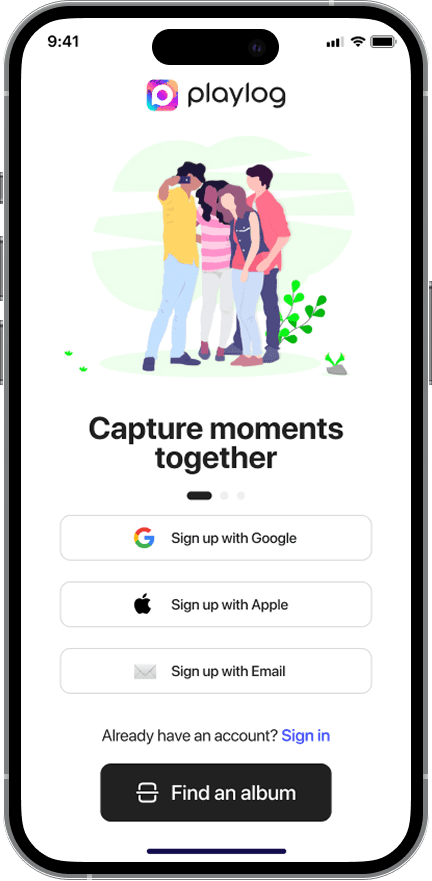
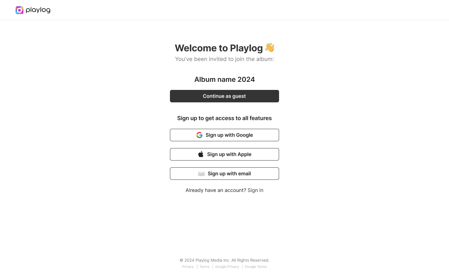
Onboarding
made easy.
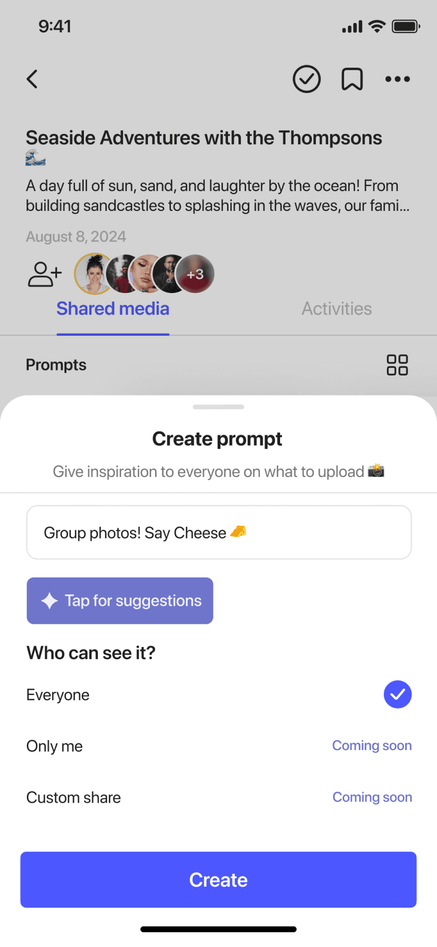
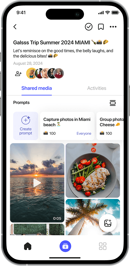
Adding prompt
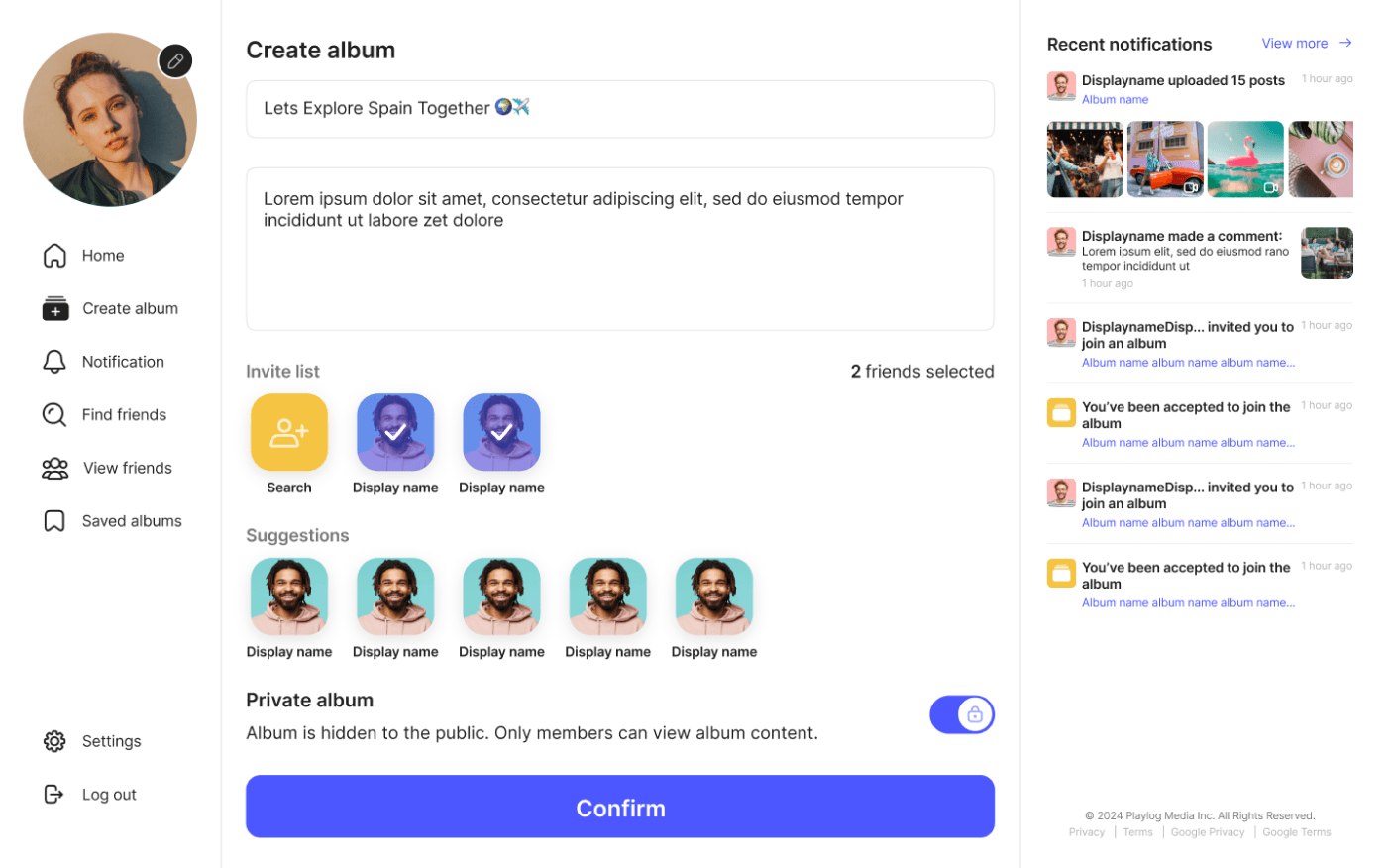
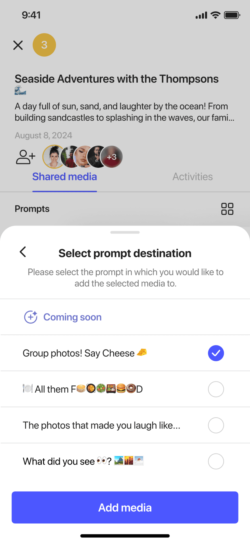
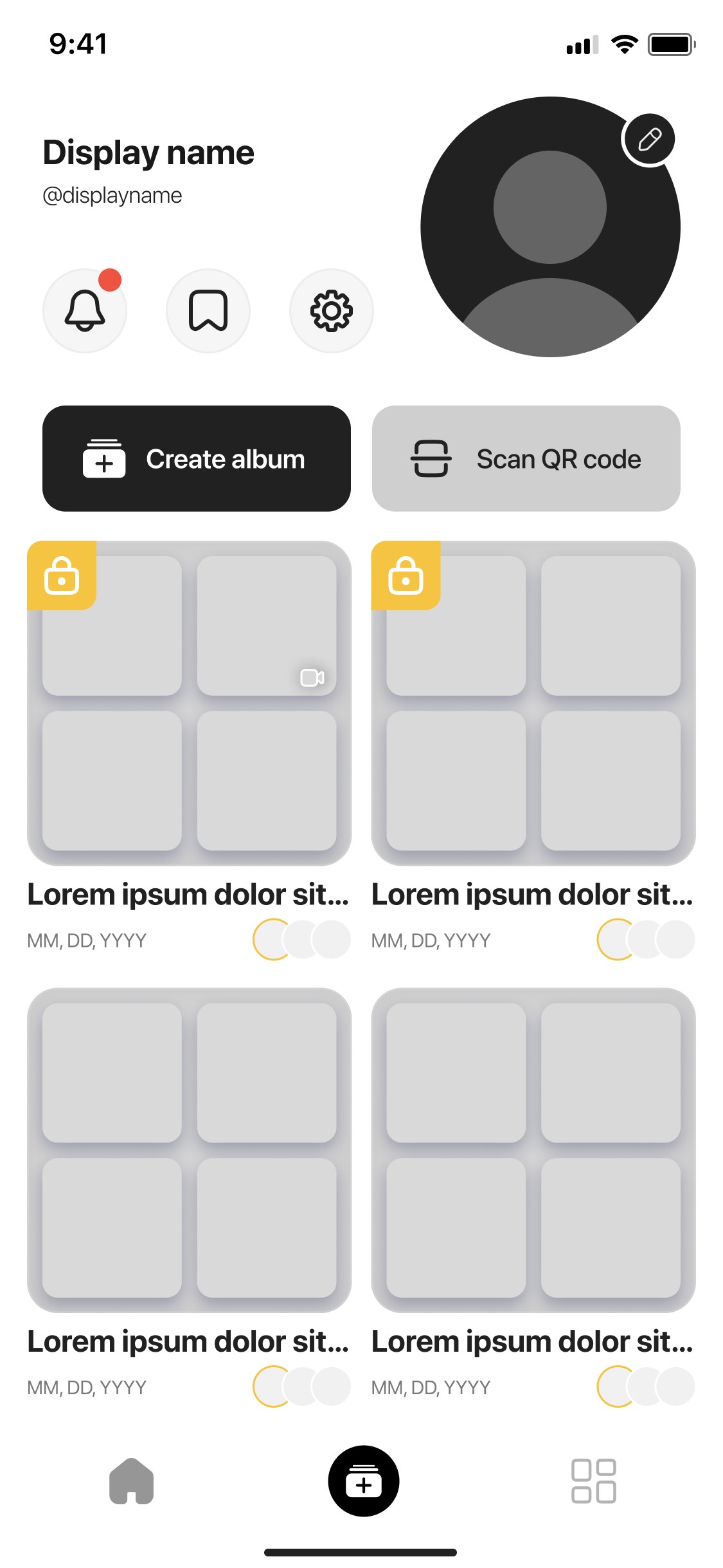
Encouraging meaningful contributions
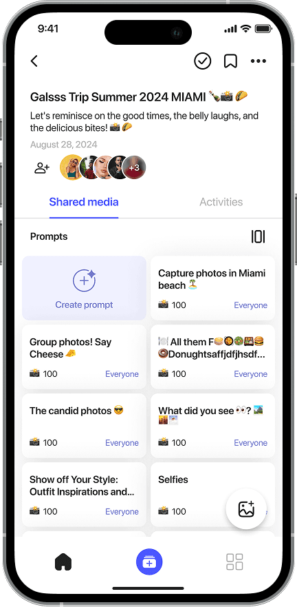
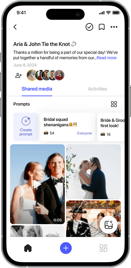
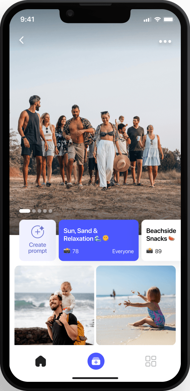
Through user interviews, I learned guests often felt unsure what to upload. To guide contributions, I introduced prompts—small, optional ways for the host to get their guests to upload engaging event memories. It turns uploading into storytelling, which helped drive engagement across event types.
Creating an Album
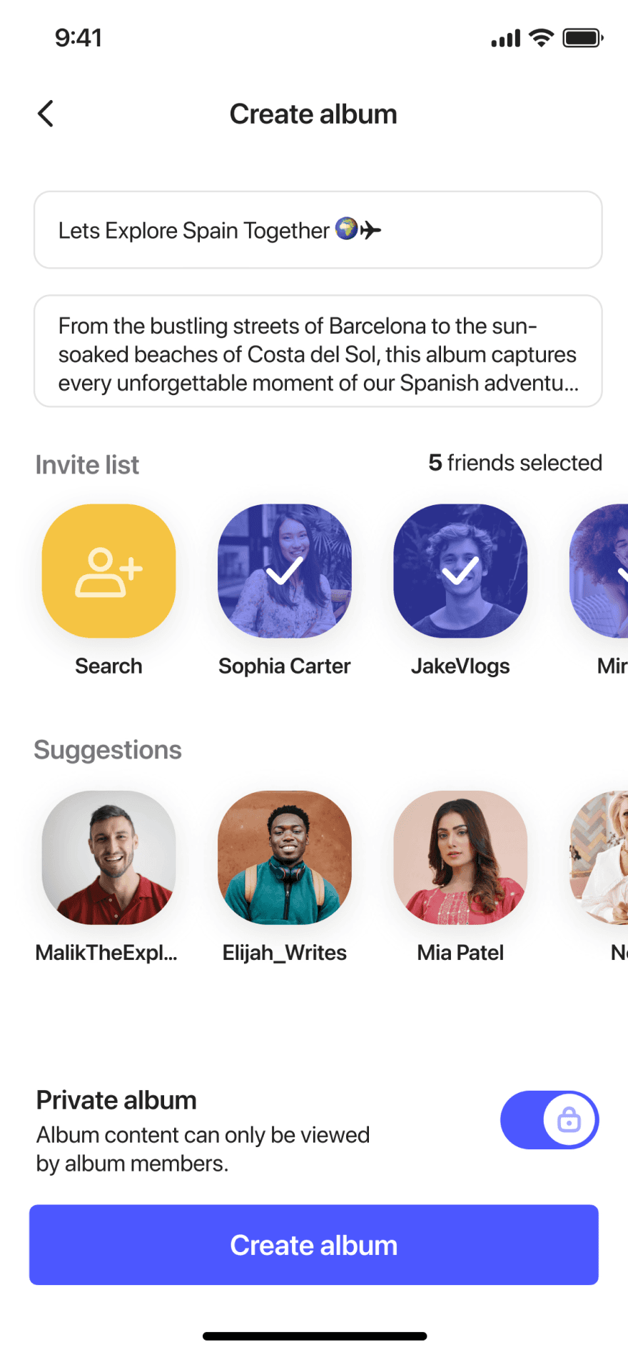
Reducing friction in album creation
One of the earliest pain points I identified was how overwhelming it felt to start a shared album on other platforms. I redesigned the creation flow to focus on clarity and momentum: just select an event type, name it, and you’re in. All privacy and sharing settings are integrated inline to avoid drop-offs.
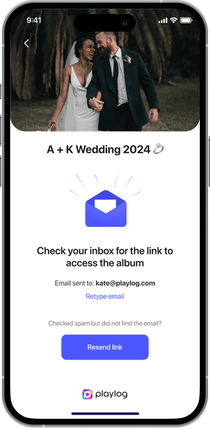
Sharing album
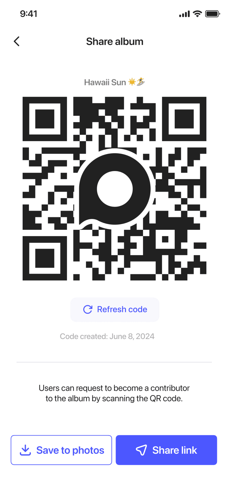
Designing guest access to feel effortless
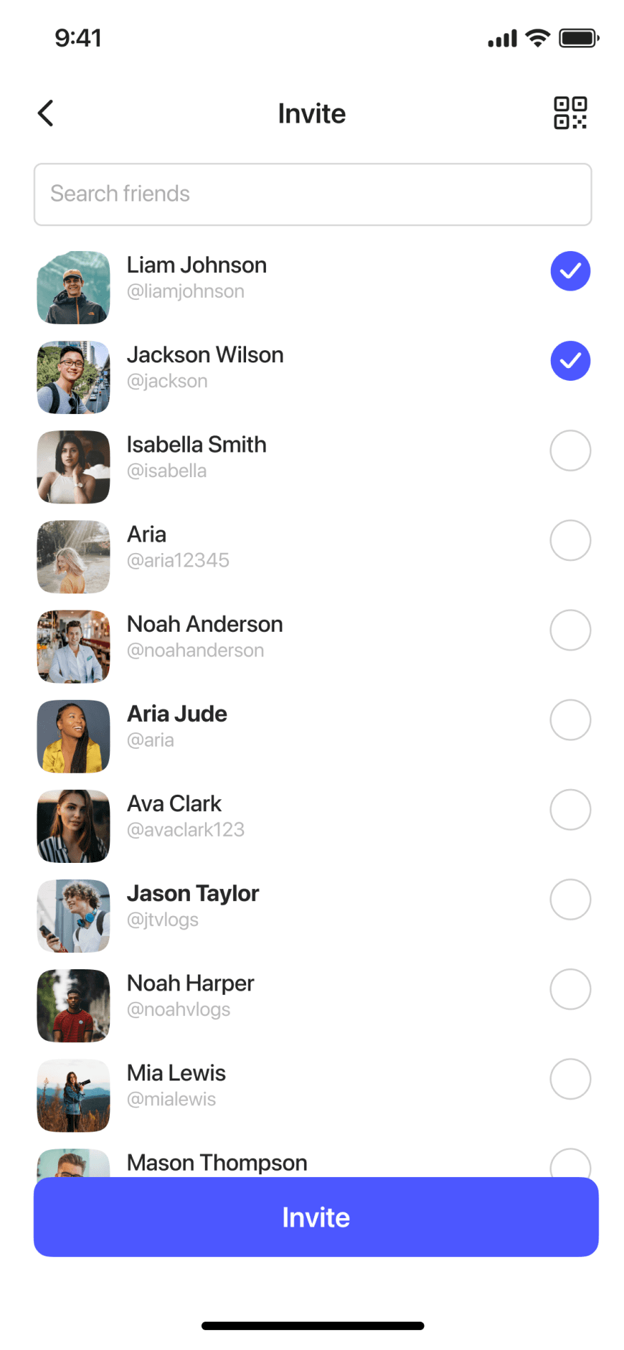
Guest collaboration needed to feel magical. I designed a no-login sharing system using QR codes and instant links. Anyone with access could view or upload without needing the app—removing a huge barrier to participation, especially at live events.
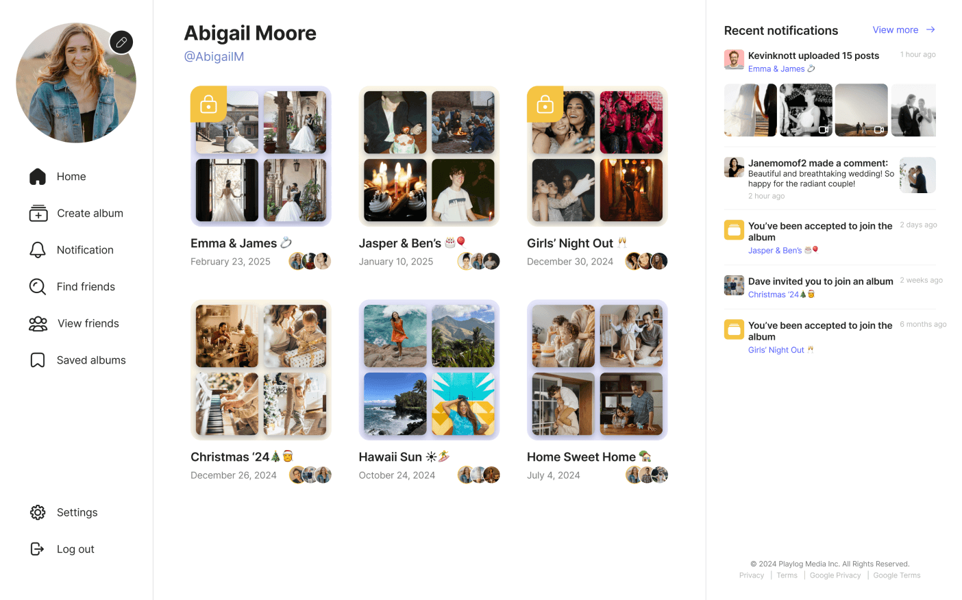
Overview
How can we remove every barrier between capturing a memory and sharing it with the people who matter most?
That was the question at the heart of Playlog.
When we looked at existing photo-sharing platforms, we saw a gap: while users could store thousands of photos, the experience of creating albums, sharing memories, and inviting others often felt heavy, complicated, and transactional. Playlog set out to change that — to create a seamless, high-quality, and privacy-first platform that made collaboration as easy and joyful as the moments themselves.
The Problem
Most photo-sharing platforms are built for storage — not storytelling or connection.
Users are overwhelmed by cluttered interfaces, lost in endless folders, and frustrated by poor-quality uploads. Organizing content becomes a burden, especially when albums stack up without intuitive categorization.
Worse still, privacy controls are inconsistent or hard to find leaving users unsure of who's seeing what. For moments that matter most like weddings, birthdays, or family milestones this lack of clarity, control, and quality erodes trust in the experience.
The Solution
I helped redesign the Playlog experience with one clear goal: make sharing memories feel as effortless as capturing them.
To do that, I focused on simplifying every part of the user journey. Creating an album now takes just a few guided steps, with event-based categories, built-in privacy settings, and optional prompts to encourage meaningful contributions from guests.
Every interaction was designed to feel intuitive, from inviting others to managing privacy. The result is a clean, fast, and joyful platform — one that's built not just for storage, but for real connection.
End-to-End Design
Mobile app design
Responsive web
Mobile & Web application facilitating
collaborative album creation.
Lead UX/UI Designer with 7+ years of turning complex ideas into intuitive, pixel perfect experiences.
Web Design
Figma

UGC

Mobile App Design
Graphic design
... Her designs changed the game for our company and generated revenue which I 100% credit her for.


Neha C.
Co-founder | CFO