Overview
The Problem
Most photo-sharing platforms are built for storage — not storytelling or connection.
Users are overwhelmed by cluttered interfaces, lost in endless folders, and frustrated by poor-quality uploads. Organizing content becomes a burden, especially when albums stack up without intuitive categorization.
Worse still, privacy controls are inconsistent or hard to find leaving users unsure of who's seeing what. For moments that matter most like weddings, birthdays, or family milestones this lack of clarity, control, and quality erodes trust in the experience.
The Solution
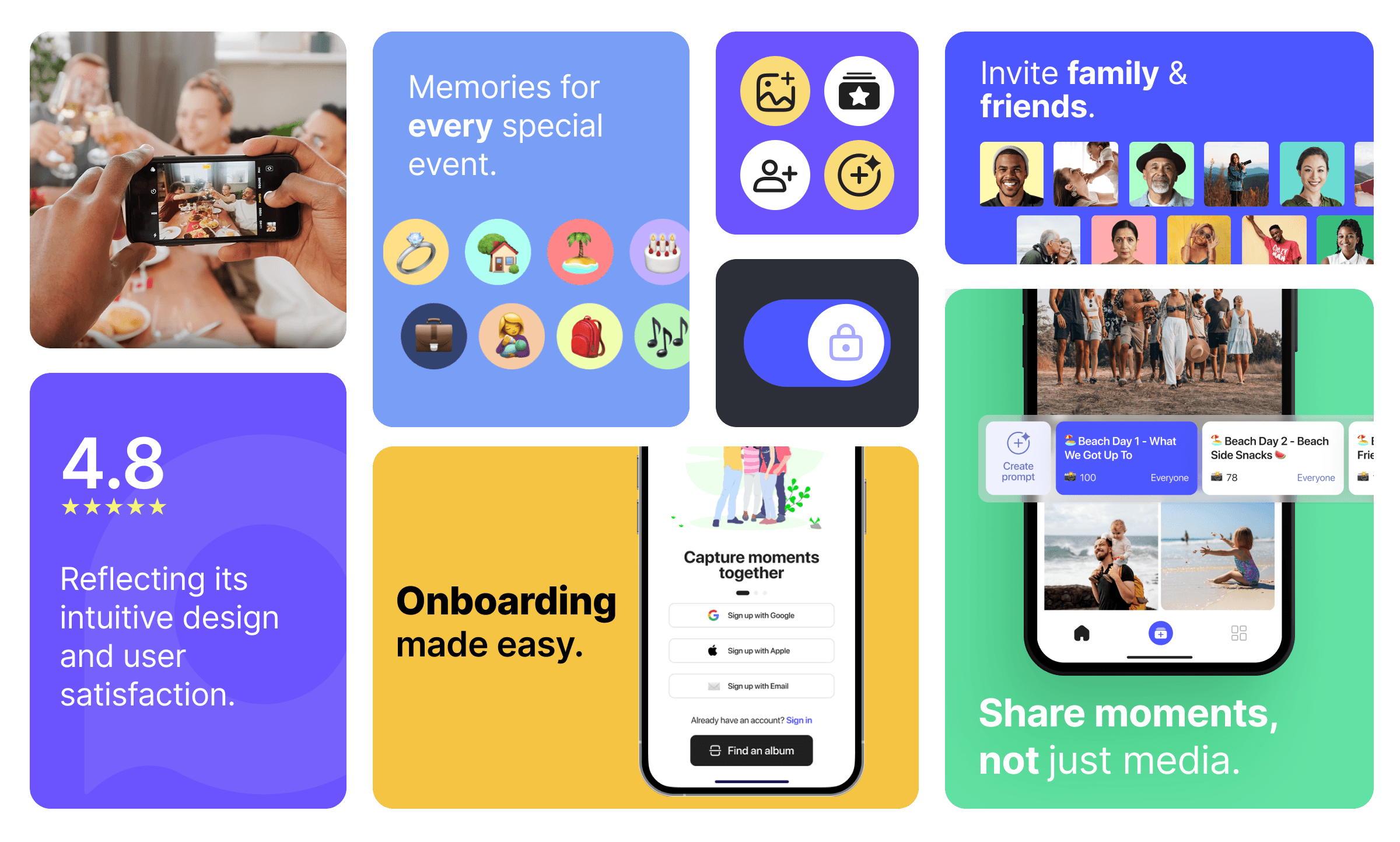
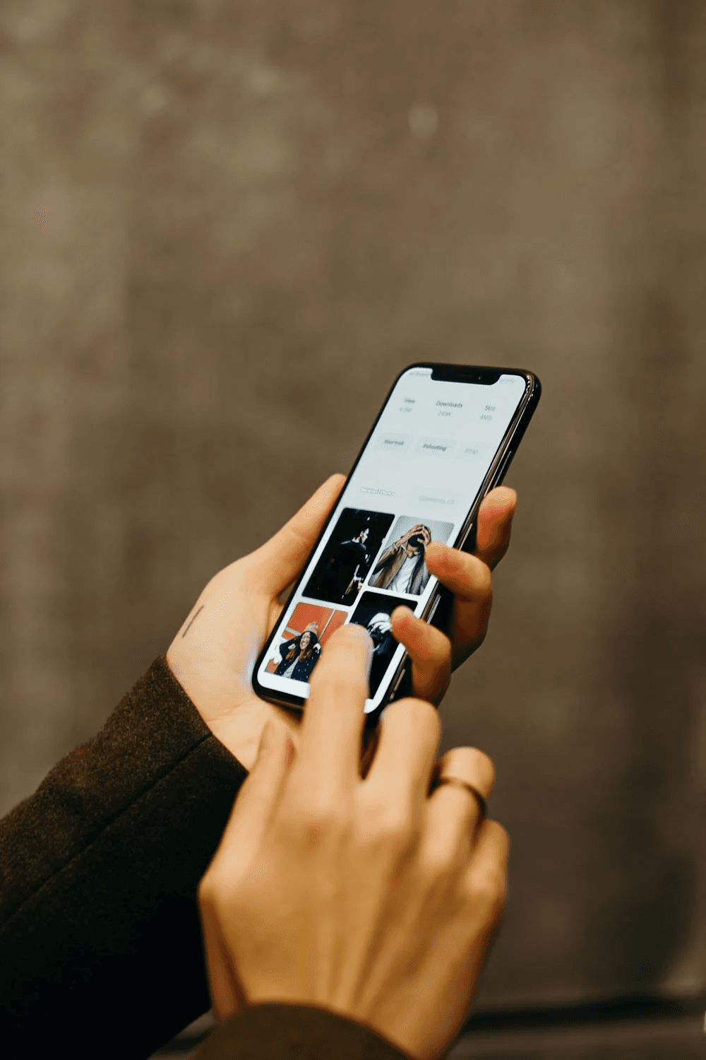
I helped redesign the Playlog experience with one clear goal: make sharing memories feel as effortless as capturing them.
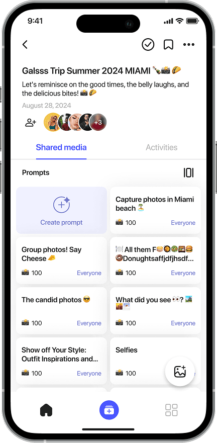
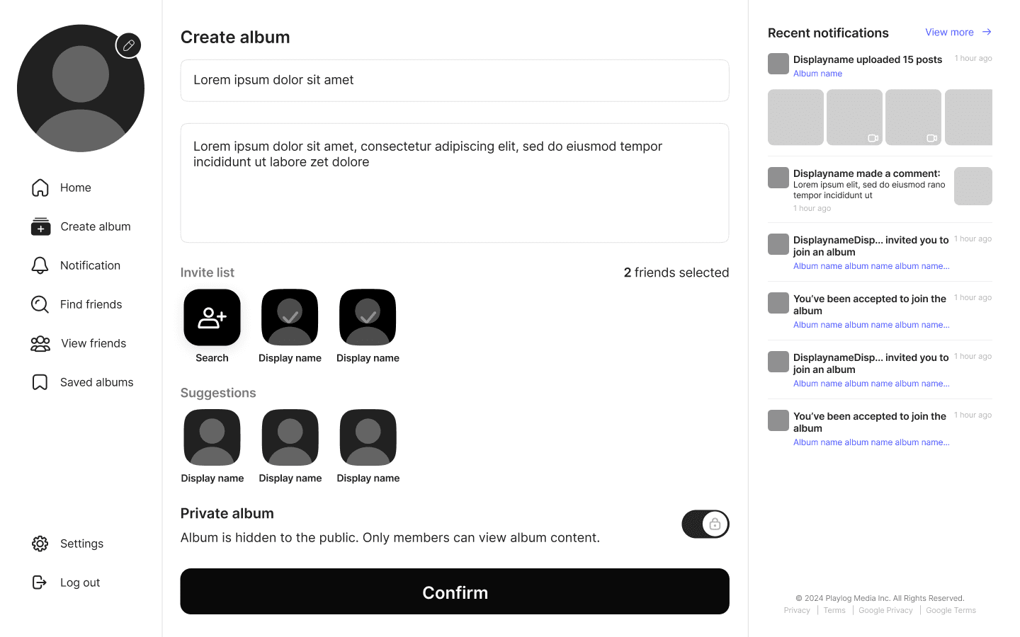
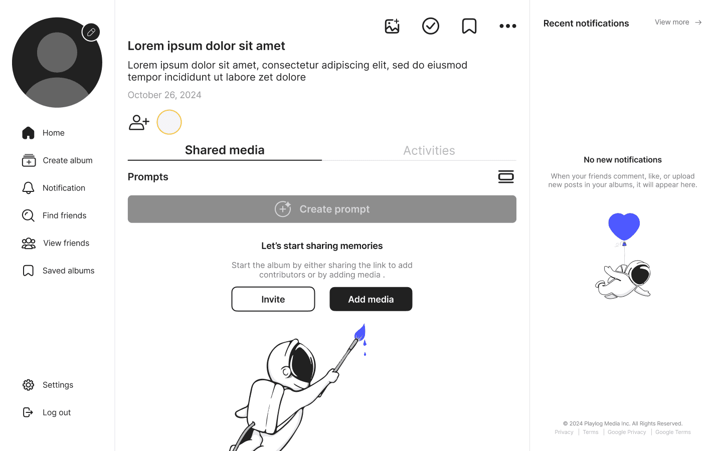
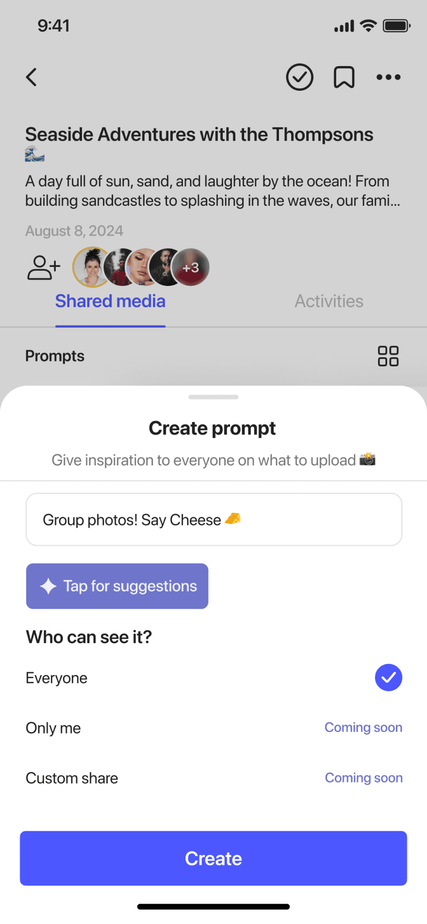
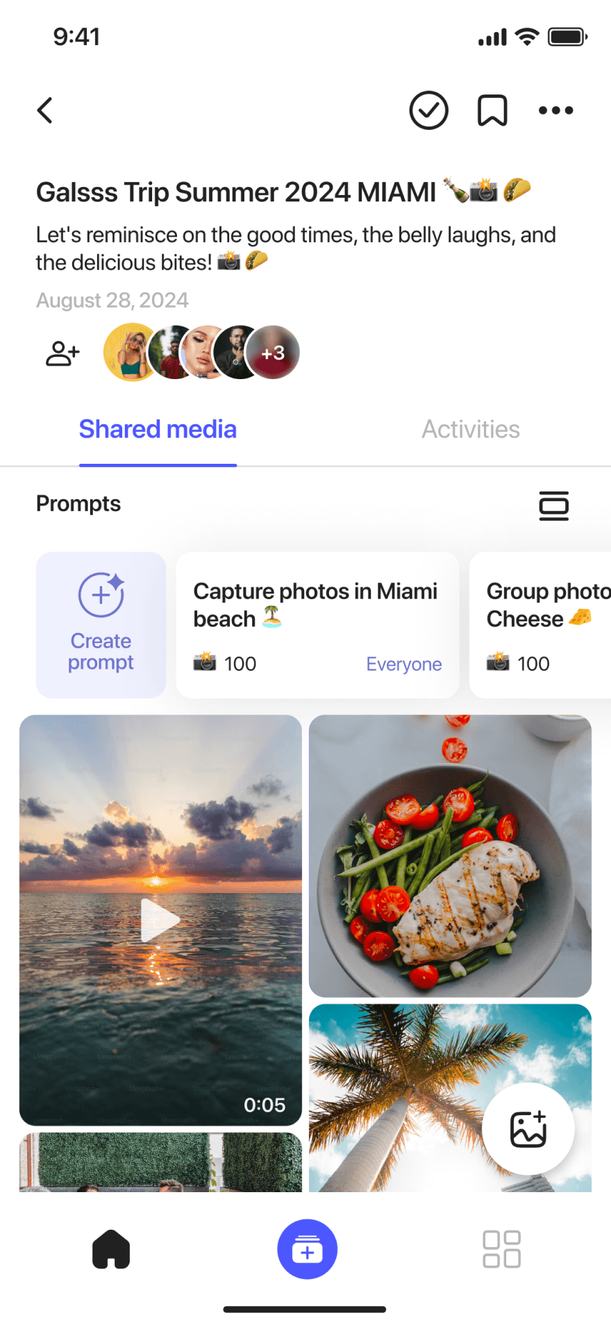
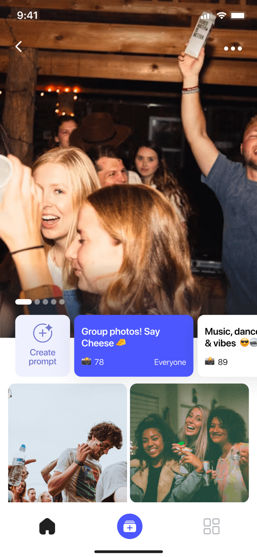
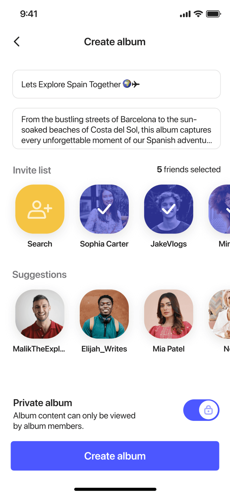
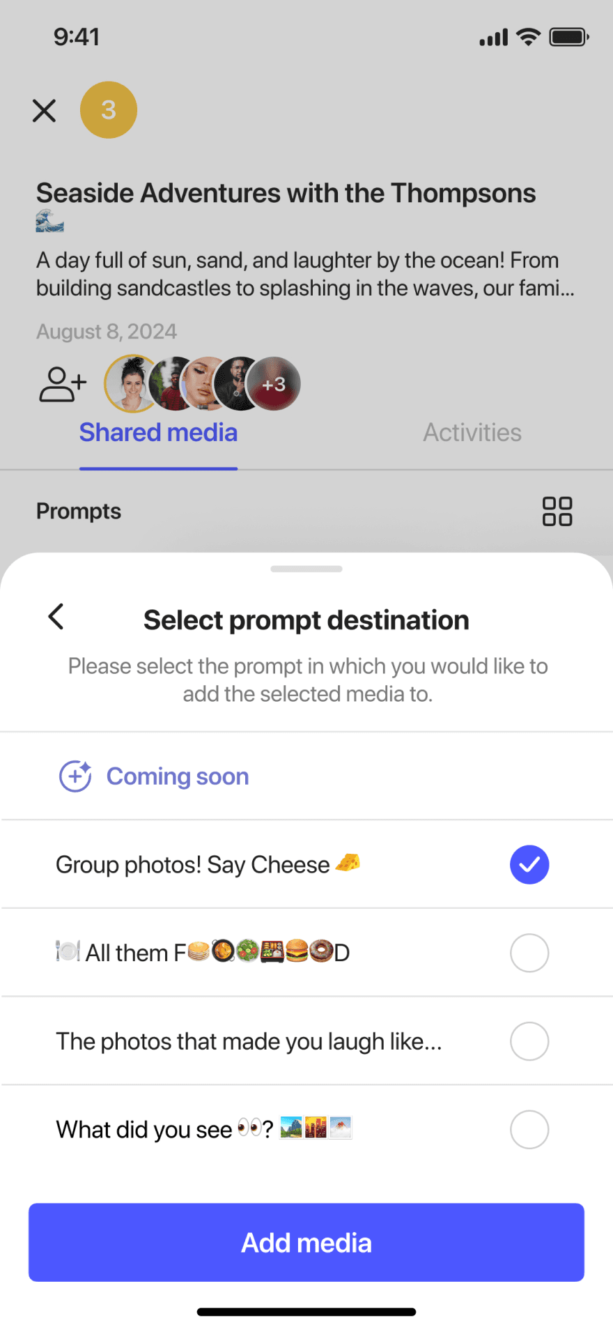
To do that, I focused on simplifying every part of the user journey. Creating an album now takes just a few guided steps, with event-based categories, built-in privacy settings, and optional prompts to encourage meaningful contributions from guests.
Every interaction was designed to feel intuitive, from inviting others to managing privacy. The result is a clean, fast, and joyful platform — one that's built not just for storage, but for real connection.
📱 Social Media (e.g. Instagram, TikTok, BeReal)
✔️ Strengths: High engagement, free, and built-in user behaviour
❌ Weaknesses: Not intended for large batch uploads, memories are ephemeral and scattered
💡Insight: Great for moments, but not for memory keeping or group curation.
📱 Major Storage Apps
(Google Photos, Dropbox, iCloud)
✔️ Strengths: Trusted for backup and archiving
❌ Weaknesses: Not built for sharing socially, often gated by storage paywalls
💡Insight: Reliable for storing, but not for interacting or storytelling
💬 Messaging Apps (WhatsApp, Messenger, Signal)
✔️ Strengths: Already established peer groups, easy access
❌ Weaknesses: Media quality is compressed, poor long-term organization
💡Insight: These tools are free and familiar, but not designed for preserving memories.
👨👩👧 Similar Photo Apps
(FamilyAlbum, Tinybeans)
✔️ Strengths: Focused, privacy-centric experiences
❌ Weaknesses: Overloaded interfaces, low trust, and often require convincing others to join
💡Insight: Too niche or clunky to gain wide adoption quickly
User Interviews
We spoke with university students, parents, travellers, creators, and everyday smartphone photographers.
Before diving into features or wireframes, I wanted to get close to the moments that matter.
What I learned wasn't just about usability. It was emotional. People want to be generous with their memories—but only when it feels easy, safe, and meaningful.
Objectives for the interviews:
Understand how users currently organize and share their photos
Identify pain points in group sharing and album creation
Learn what motivates (or stops) users from contributing photos
Discover emotional triggers around photo privacy, ownership, and relevance.
Explore how users manage large quantities of photos across events.
Sample Participants:
Jason
Early 20s
Student & photographer
Charmaine
Mid 20s
Consultant / Traveller
Sejung
Late 30s
Investor & New Dad
NAME
AGE RANGE
ROLE / BACKGROUD
If it takes explaining, it's already too hard.
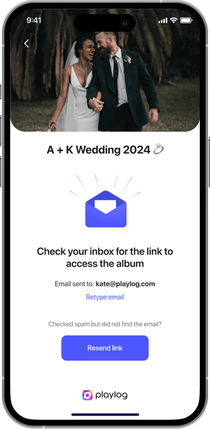
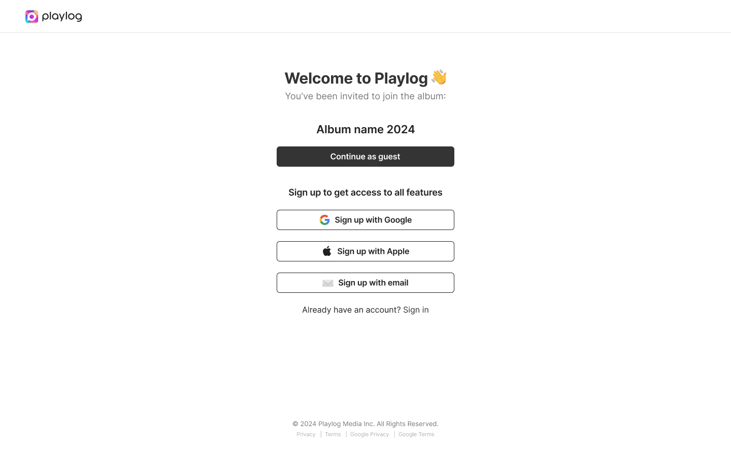
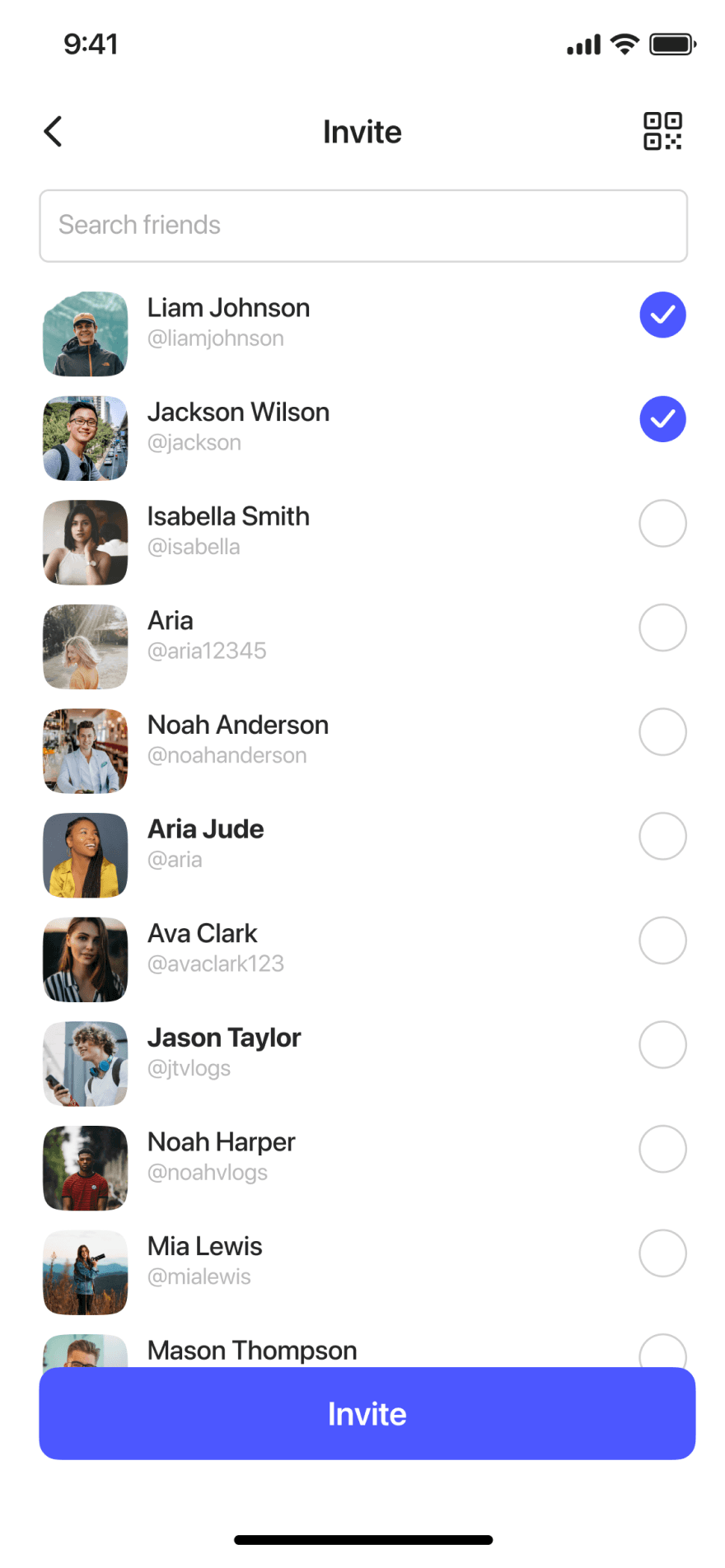
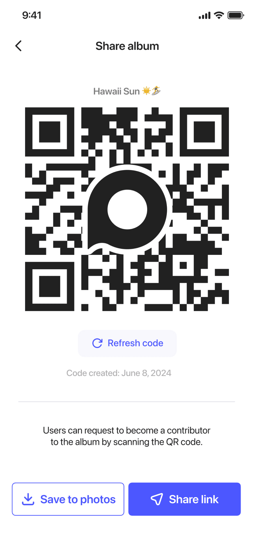
Users didn't want to guide guests through a new platform. QR codes and instant links (no account needed) became a must-have solution.
Too many uploads ≠ meaningful memories
"When everyone dumps all their photos, I don't know what to look at.”
Mass uploads overwhelmed users. Many expressed the need for photo prompts or filters to help surface meaningful contributions.
Privacy is assumed, but not always clear
“I shared an album and didn't even know if it was private or not.”
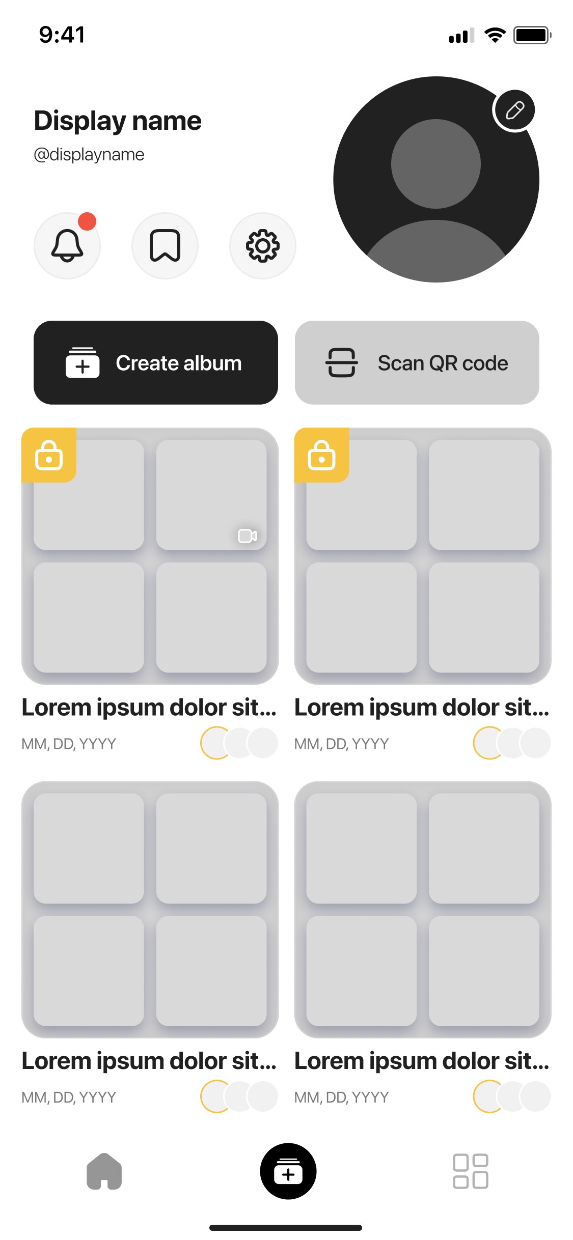
Users were confused by privacy settings in other apps. They wanted a visual cue (like a lock icon) and one-tap control over visibility.
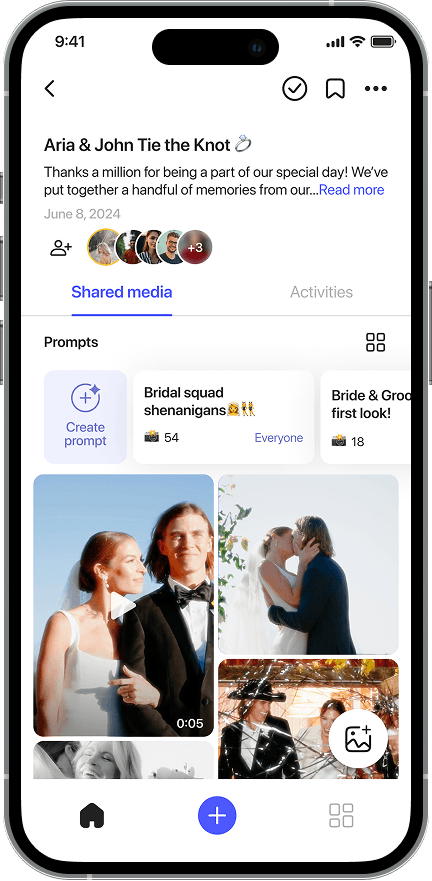
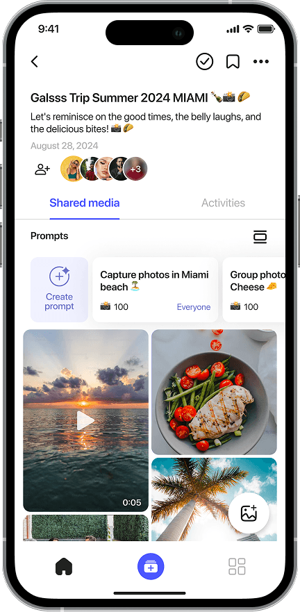
Albums need personality, not just storage
“All the photos are there... but it doesn't feel like an event."
Users wanted albums to feel intentional. Event tagging, themed prompts, and album types helped make each memory feel curated.
Overall after synthesizing all our interviews, testing notes, and usability insights, a few patterns stood out across demographics and sharing behaviours:
🙋
The "champion" is tired
The person organizing and nudging others feels burnt out. Users want tools that encourage participation, not pressure.
🔗
Sharing breaks when it feels like work
Steps like downloads or logins kill momentum. QR codes and shareable links are must-haves for flow.
📷
Not just storage it's memory making
Users want albums that feel like moments, not folders. They're curating emotional experiences, not just saving images.
🔐
Quality and privacy are expected
People assume high-res uploads and clear visibility settings. If it's confusing or hidden, trust erodes quickly.
Without categorization or context, albums feel messy. Event tags and prompts help users build purposeful collections.


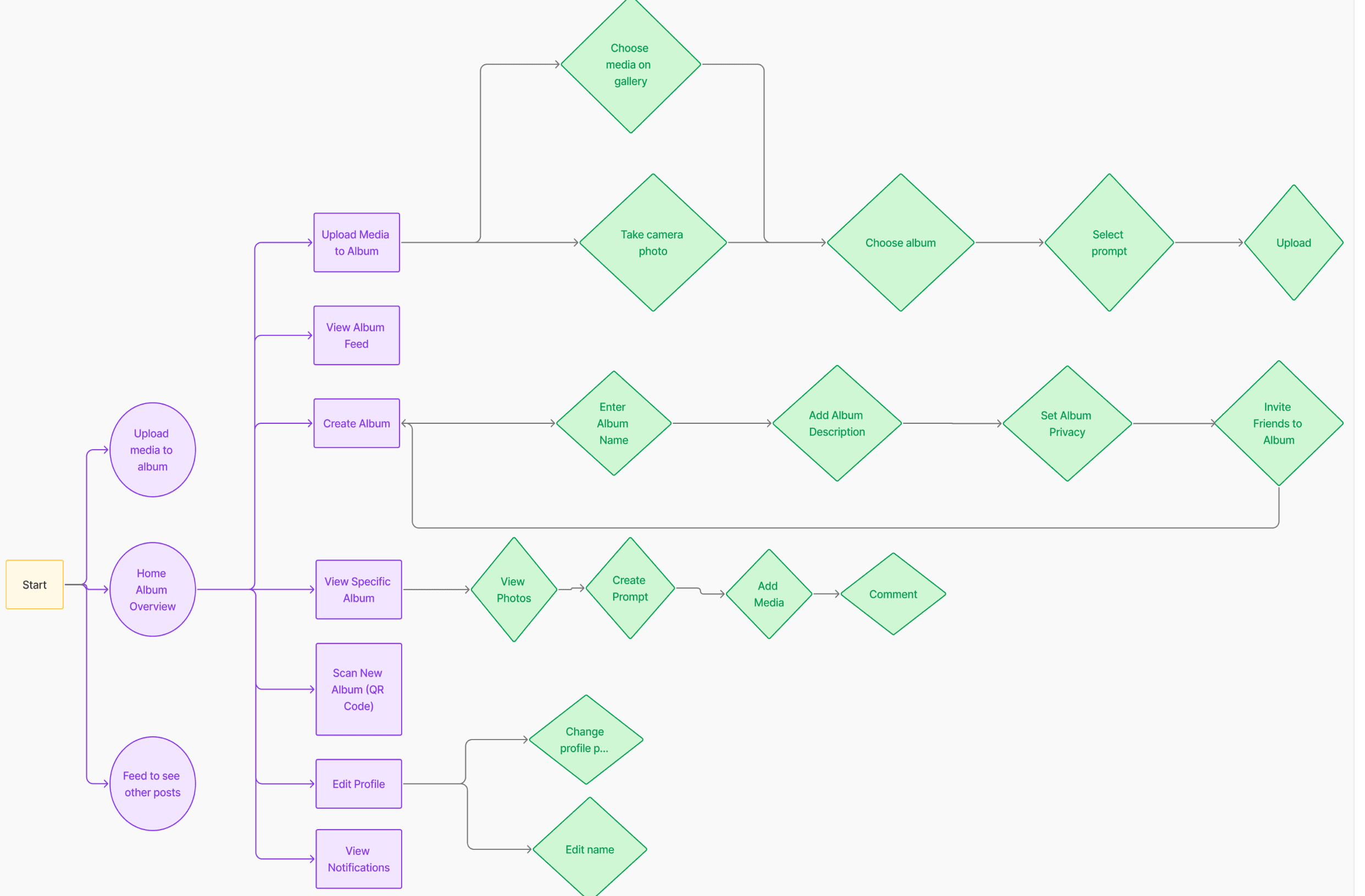
User Flow
SF PRO Display
Style guide
ABCDEFGHIJKLMNOPQRSTUVWXYZ
ABCDEFGHIJKLMNOPQRSTUVWXYZ
1234567890
Success
#EAFEF7
#7DD5B4


Few Components
UI KIT

📈 Achieved
🚀 Increased user onboarding completion by 25%
After redesigning the onboarding flow with
3-tap sign-up and SSO (Google/Apple), users completed account creation faster and with less friction.
80%
🎯 Increased engagement
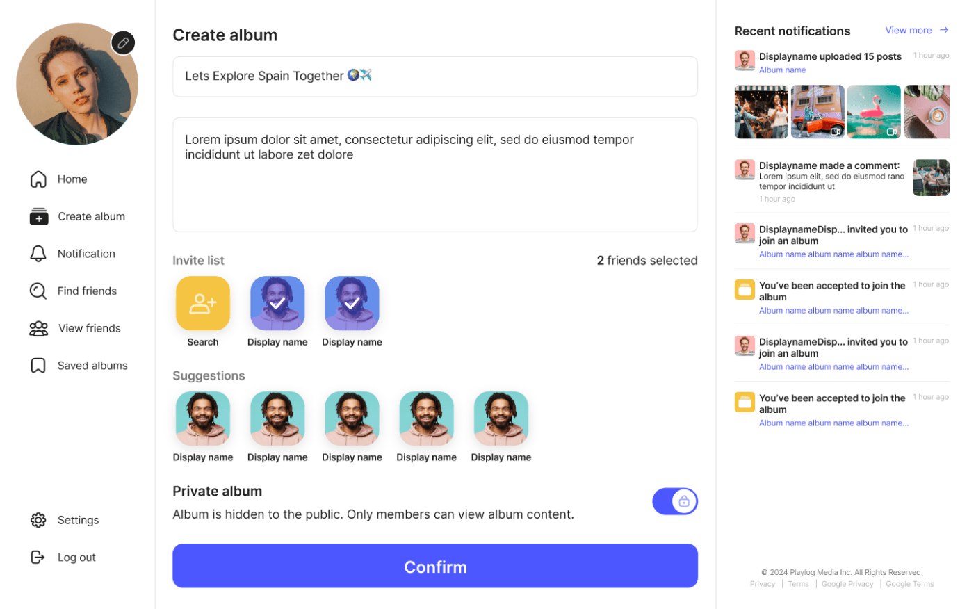
By streamlining album creation into just a few guided steps (event type → title → privacy → prompts), users were able to set up albums faster, reducing the drop-off rates.
🔗 Boosted Guest Participation with Seamless Sharing
QR code invitations & instant links allowed guests to upload media without needing an account, leading to a higher volume of shared memories per event.
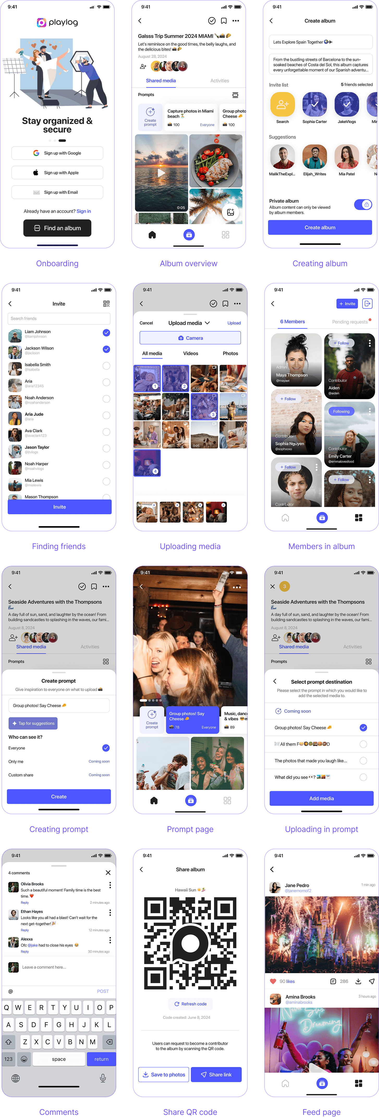
High-fidelity screens
High-fidelity screens


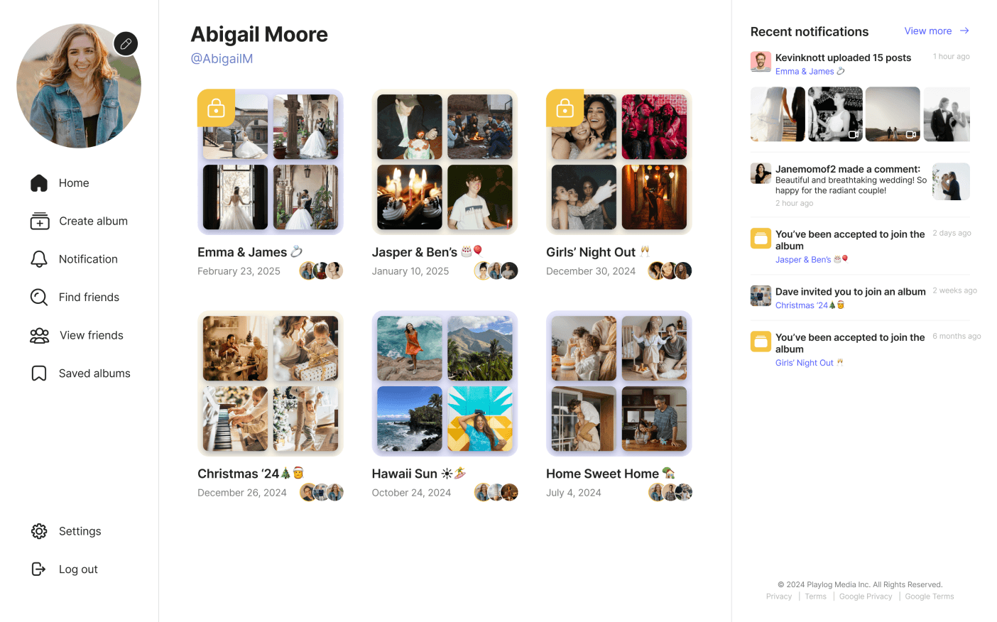
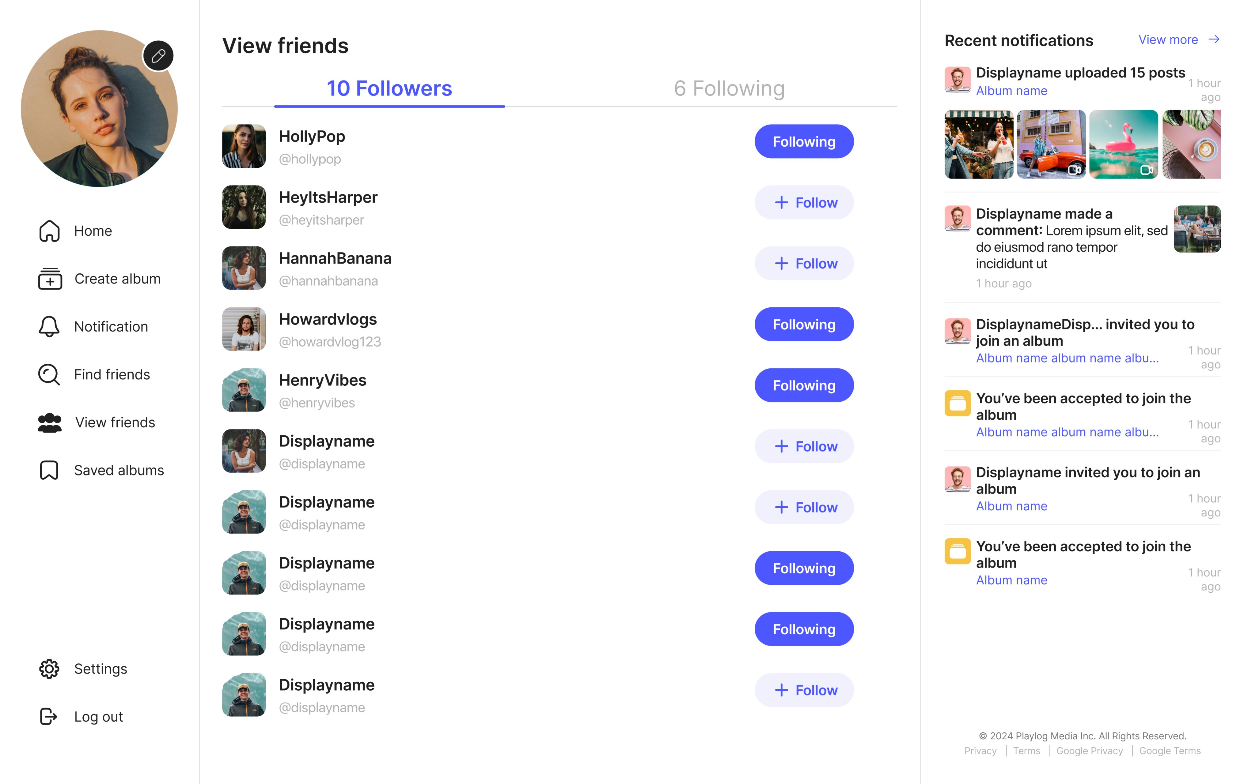
High-fidelity web screens


Check it out for yourself.

Get the Playlog App
Scan the QR code to download the iOS app directly from the App Store.

Find us on web 👉 www.playlog.com
OR